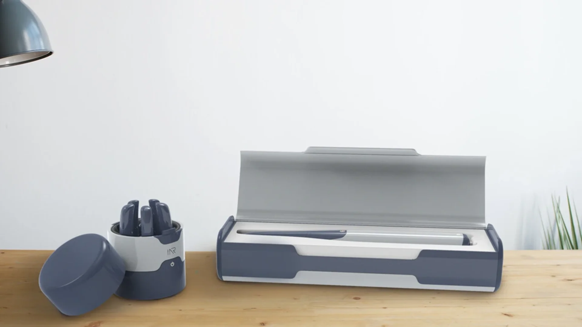
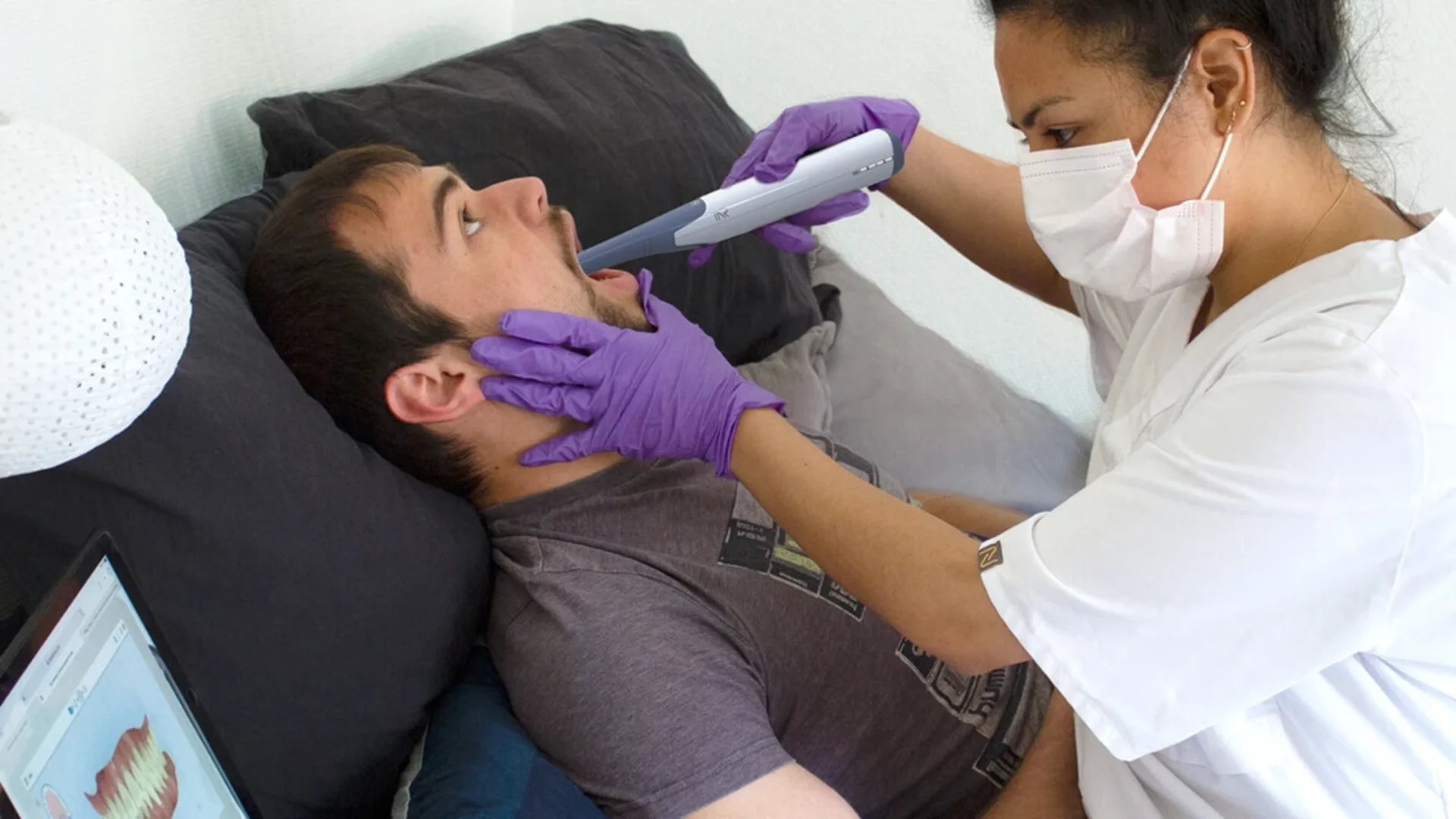
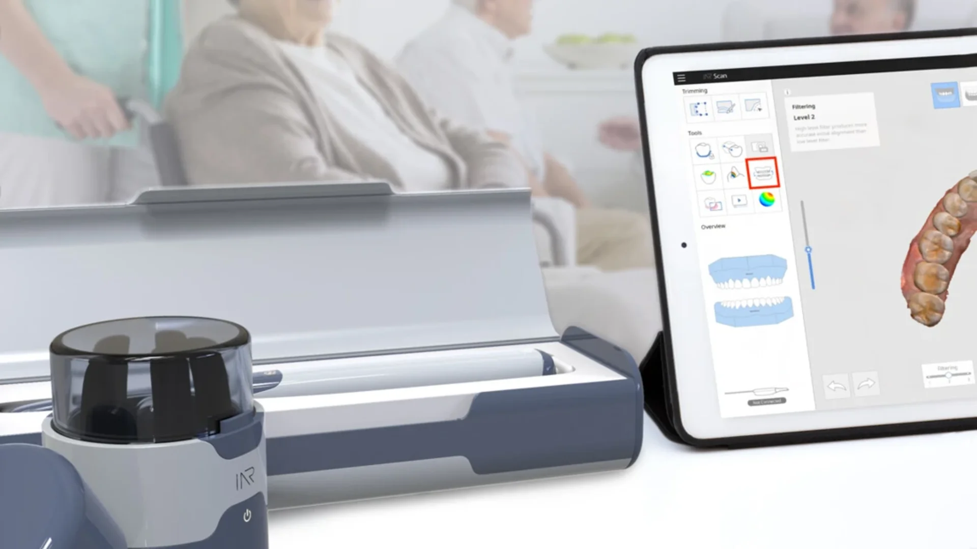
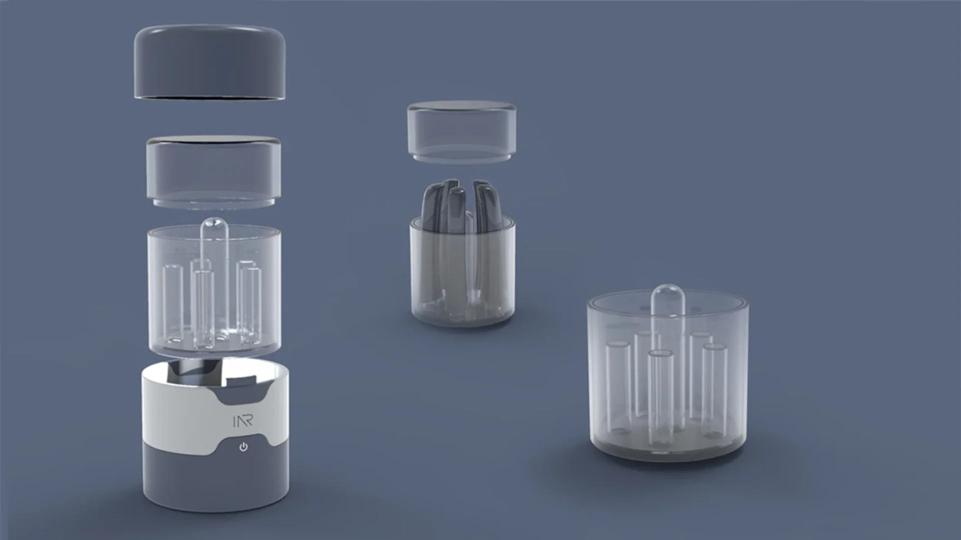
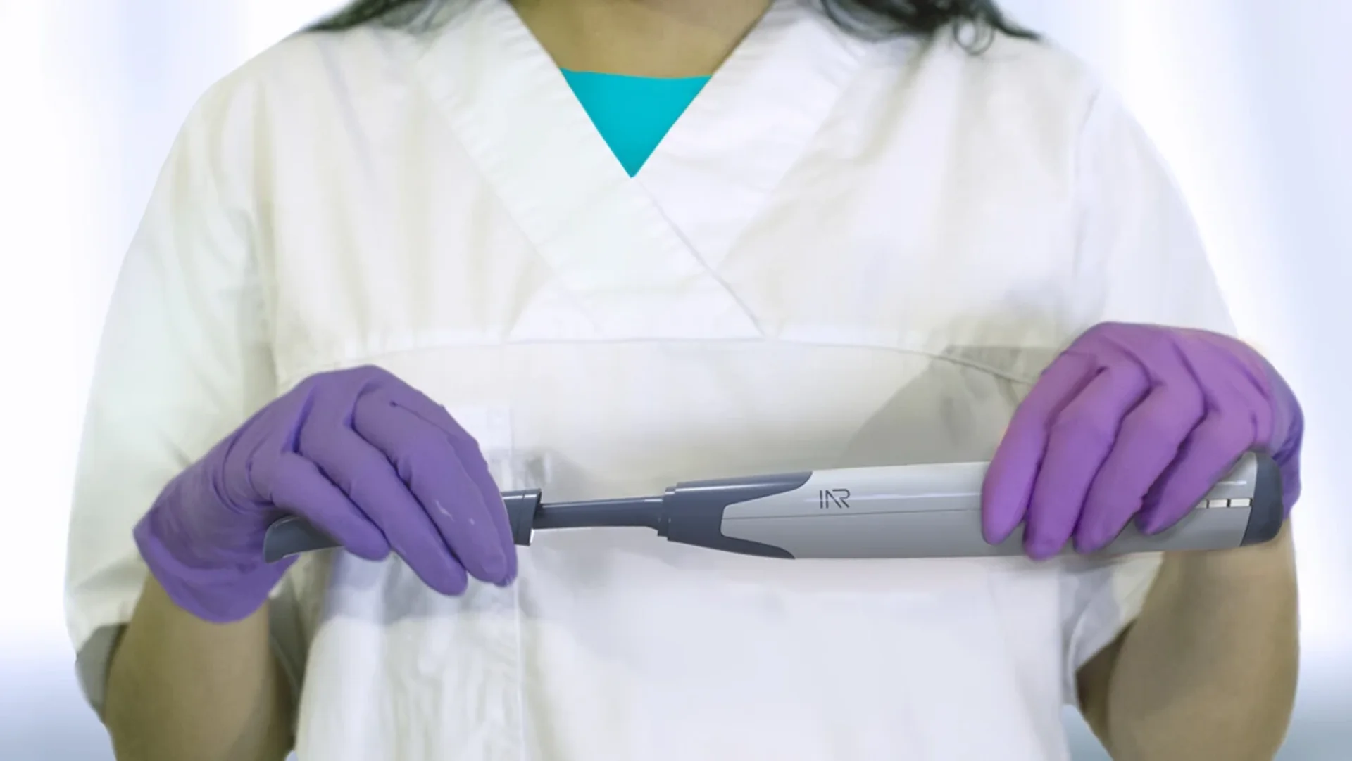
Portable Dental Diagnostics IAR
Role: UX & Industrial Design · Co-developed with clinicians
Elderly patients who can't travel to a dental clinic still need diagnosis. The current answer don't go isn't a solution. This project set out to design a portable dental scanning kit that could be brought to the patient: to care homes, to living rooms, to wherever the patient actually is.
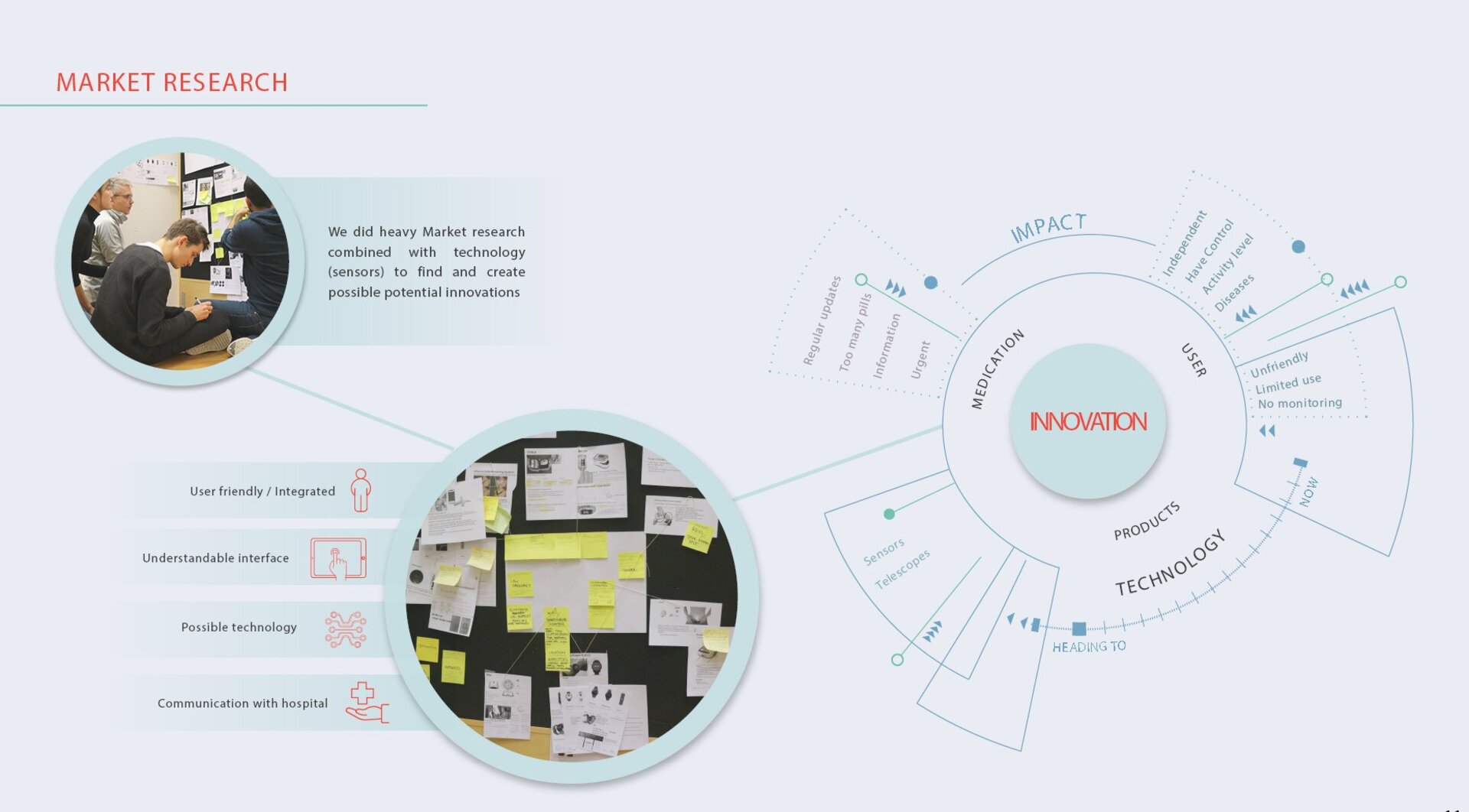
The design process was built around dental clinicians from the start. Not as consultants as co-designers. Understanding what they needed to trust a portable tool, what information had to be immediately legible at a distance, and what couldn't be compromised from a clinical workflow perspective shaped every decision.
The result cut a standard diagnostic workflow from 30 minutes to 3. Not by removing steps by removing friction that was never clinically necessary to begin with.
Research NDA Detailed clinical process data and device schematics are protected. Visual work and process available on request.
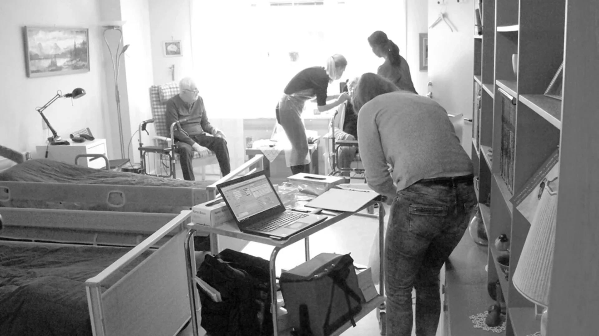
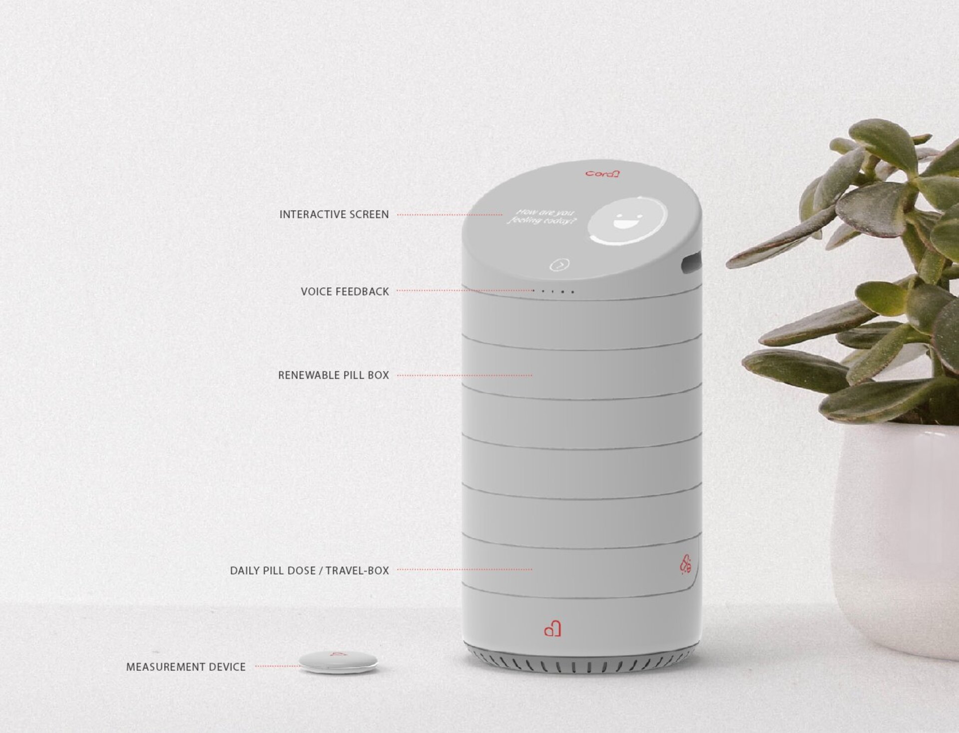
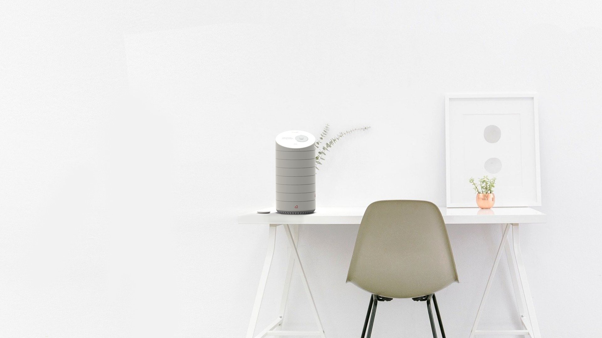
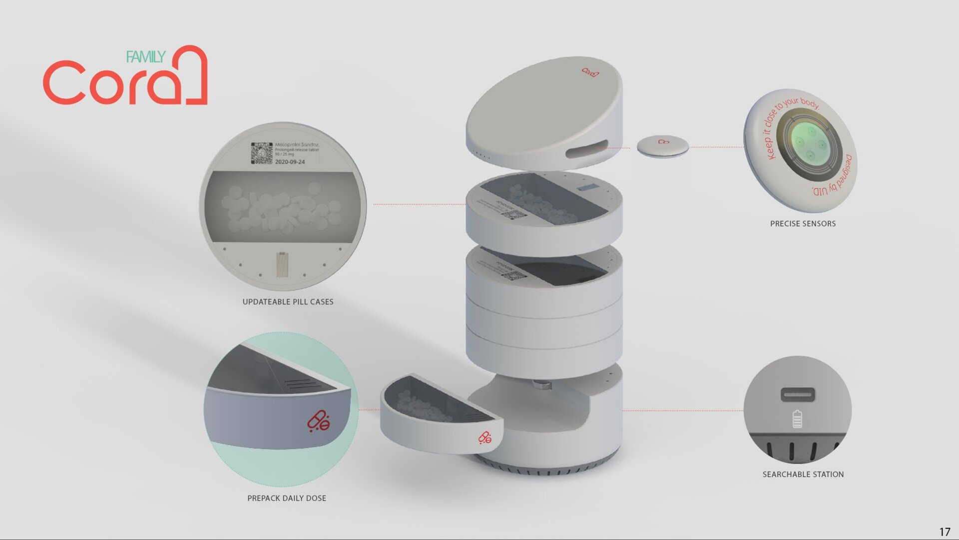
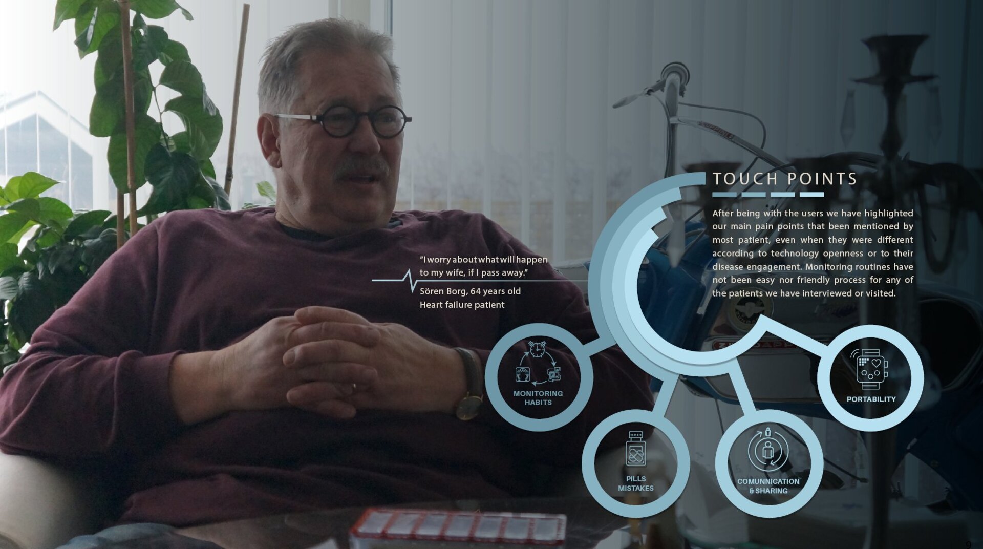
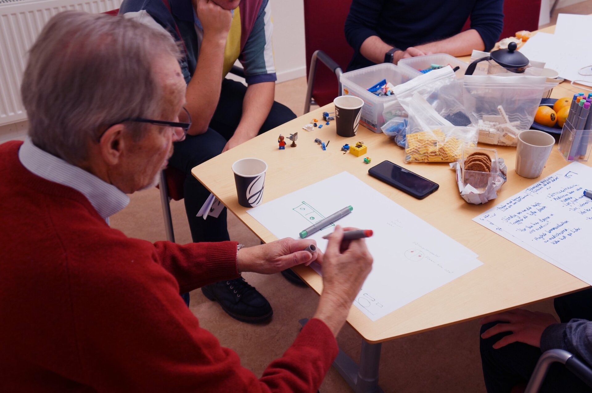
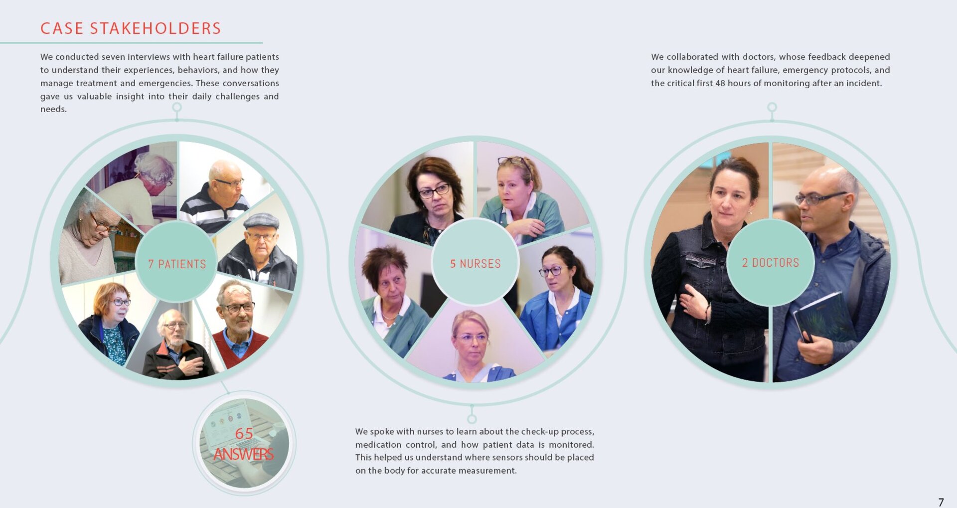
Heart Failure Home Monitoring
Role: UX Researcher · Co-design Facilitator
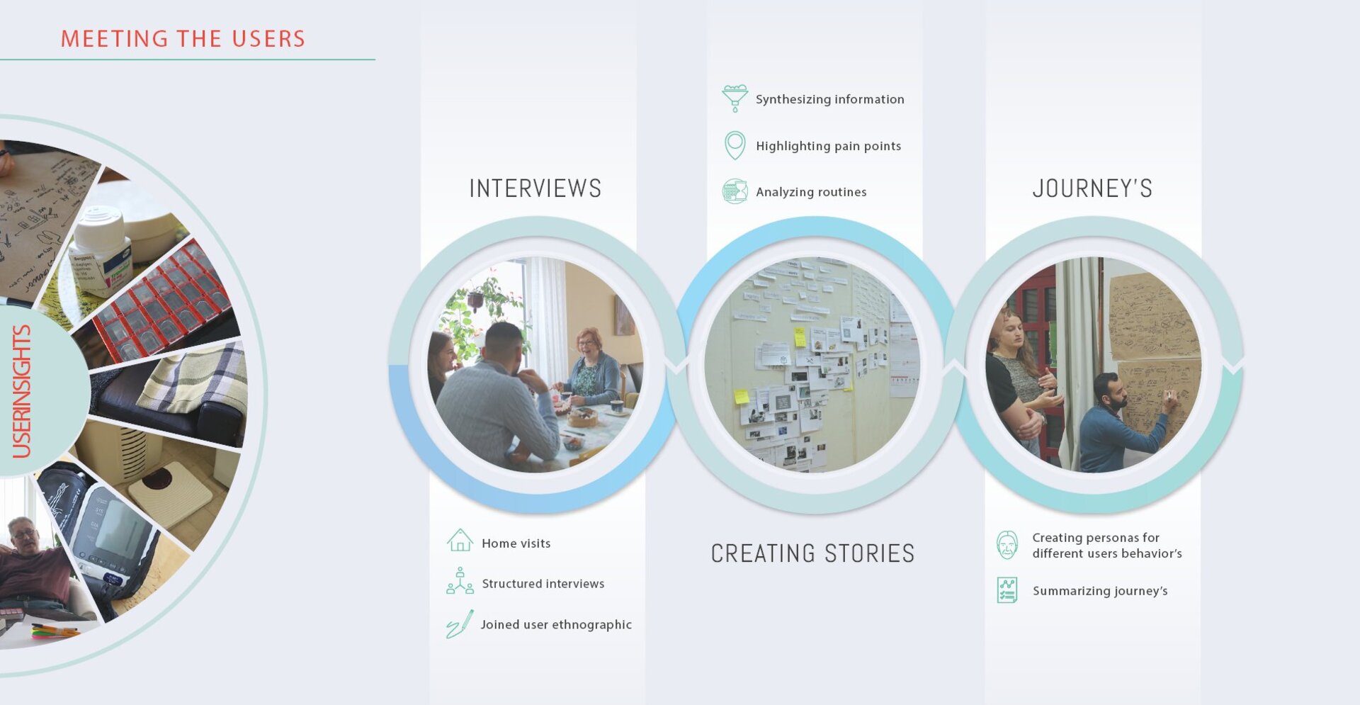
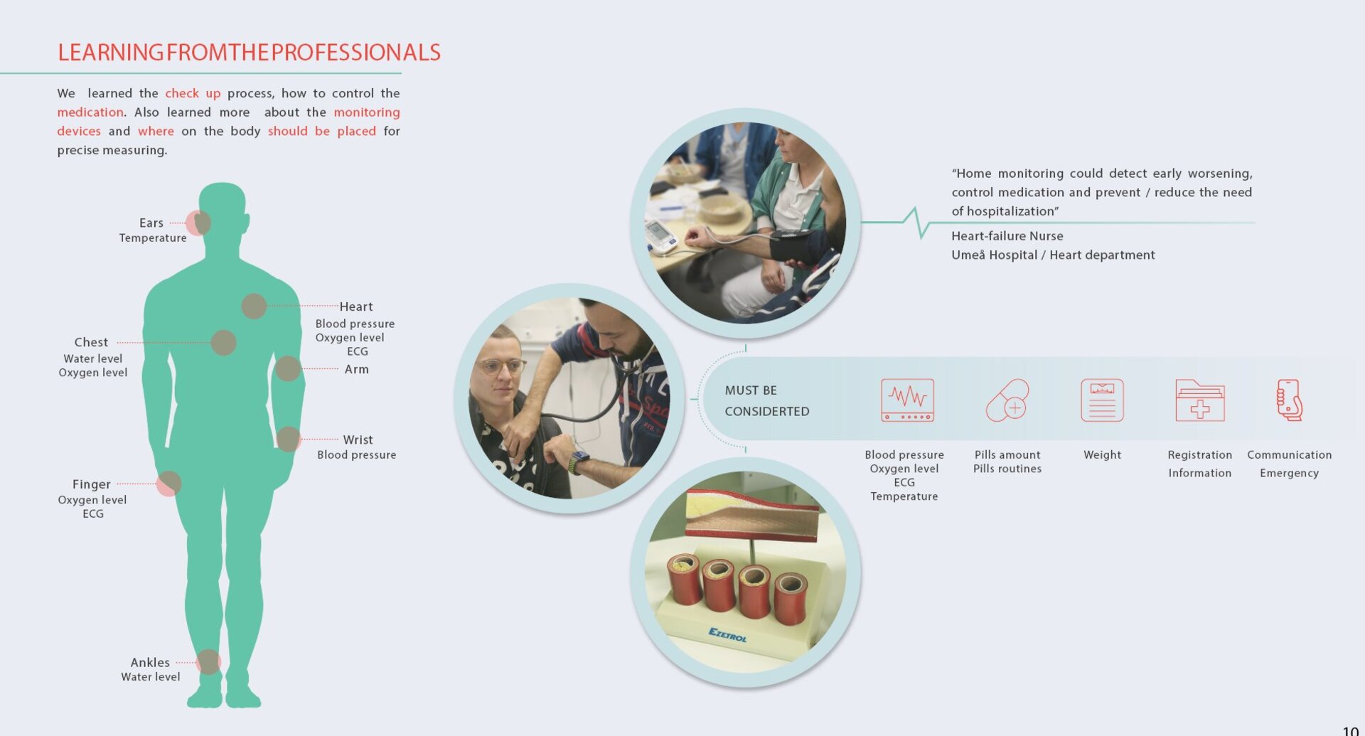
Heart failure patients are often discharged with a condition that requires ongoing, daily self-management and left largely alone with it. The gap between what the clinic assumes a patient understands and what they actually experience at home is significant, and dangerous.
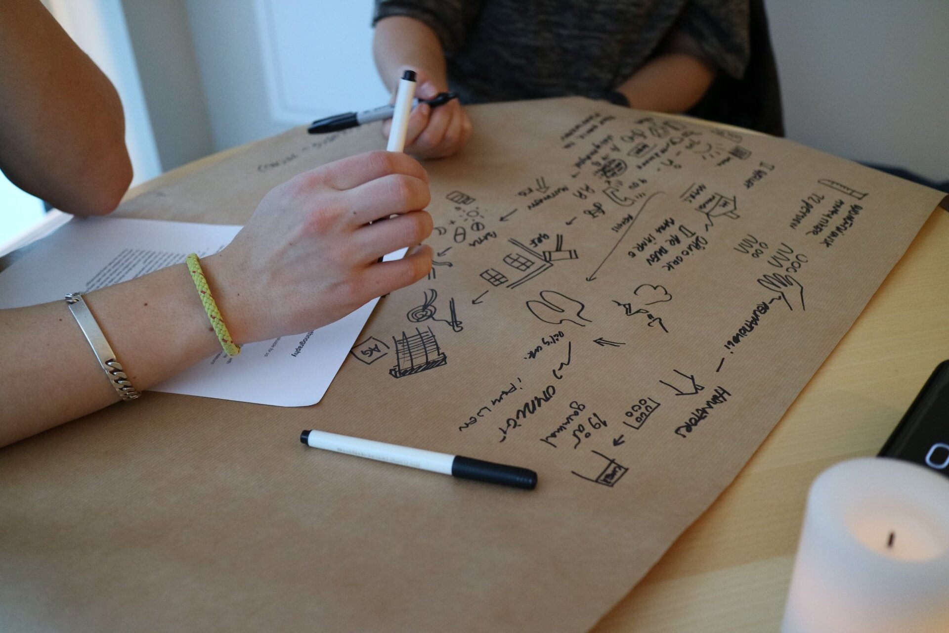
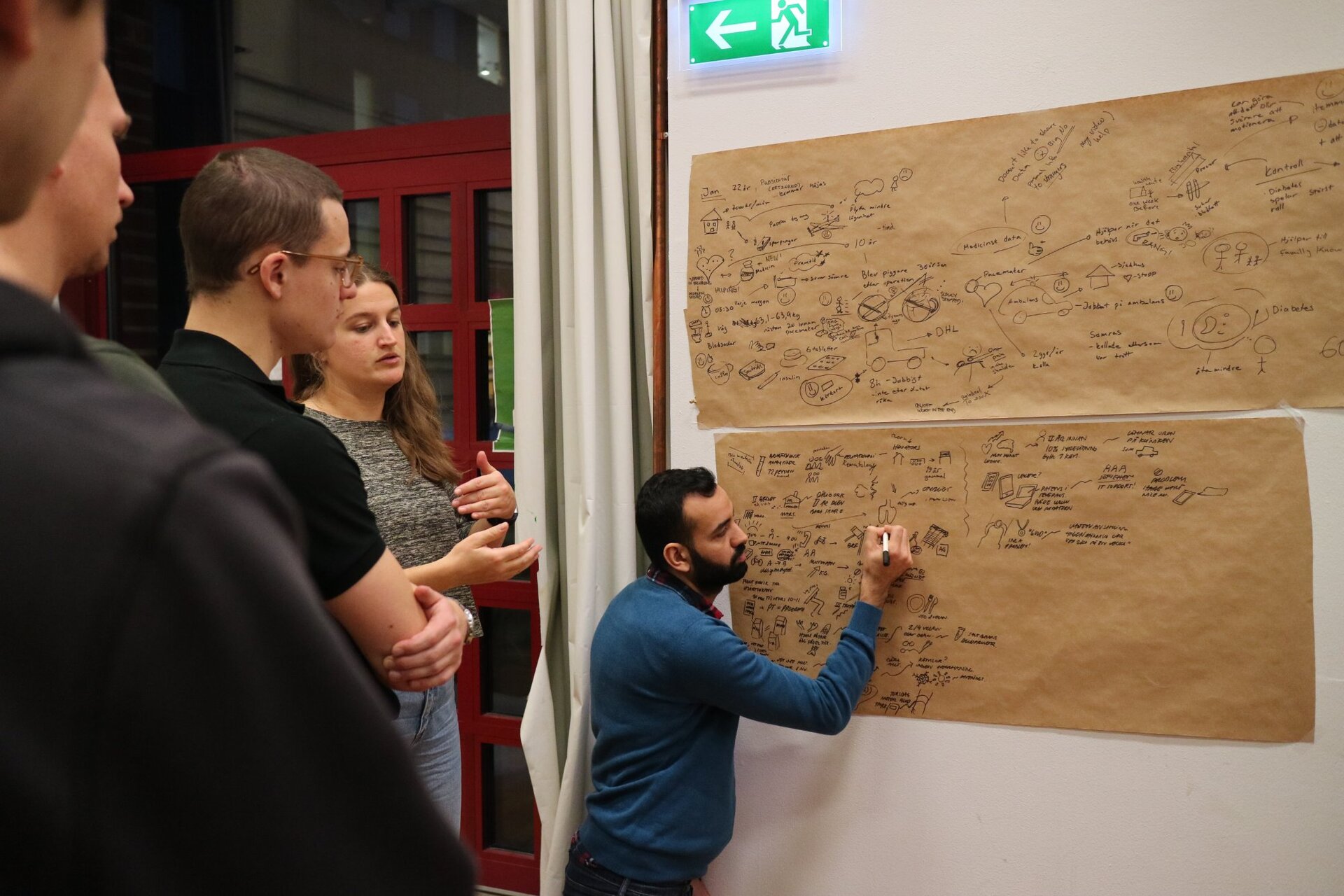
This project was built through home visits. Not interviews visits. Sitting with patients in their kitchens, watching how they interacted with their monitoring routines, understanding what was confusing, what was missed, what was ignored because it felt irrelevant or overwhelming.
The output was a home-monitoring system designed around the patient's actual cognitive and emotional state not the clinical ideal of an engaged, informed, compliant patient. Because that patient rarely exists in the wild.
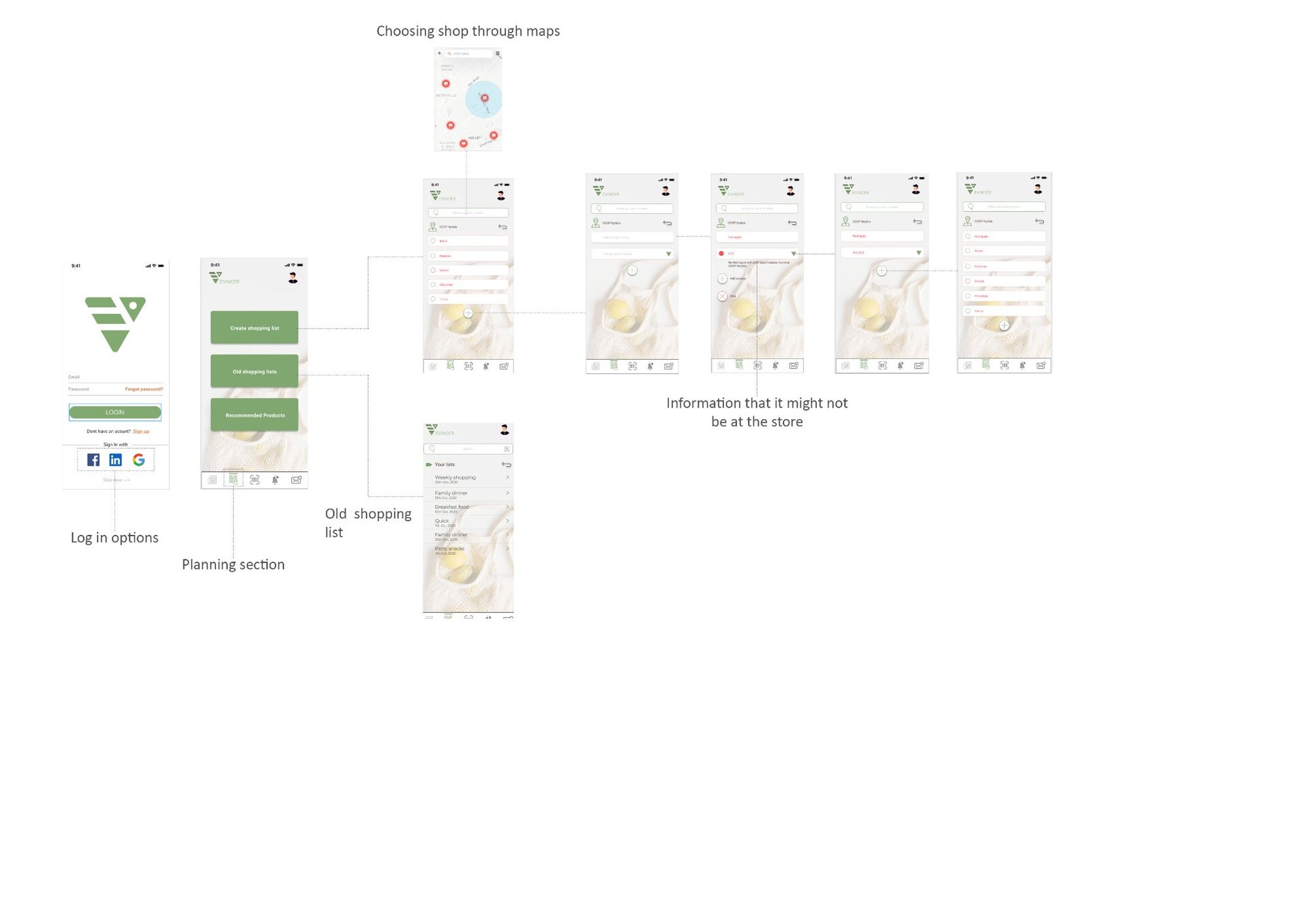
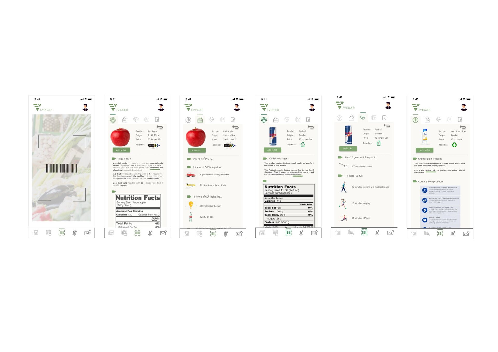
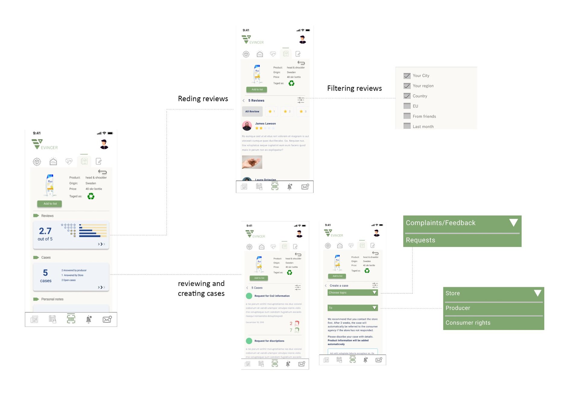
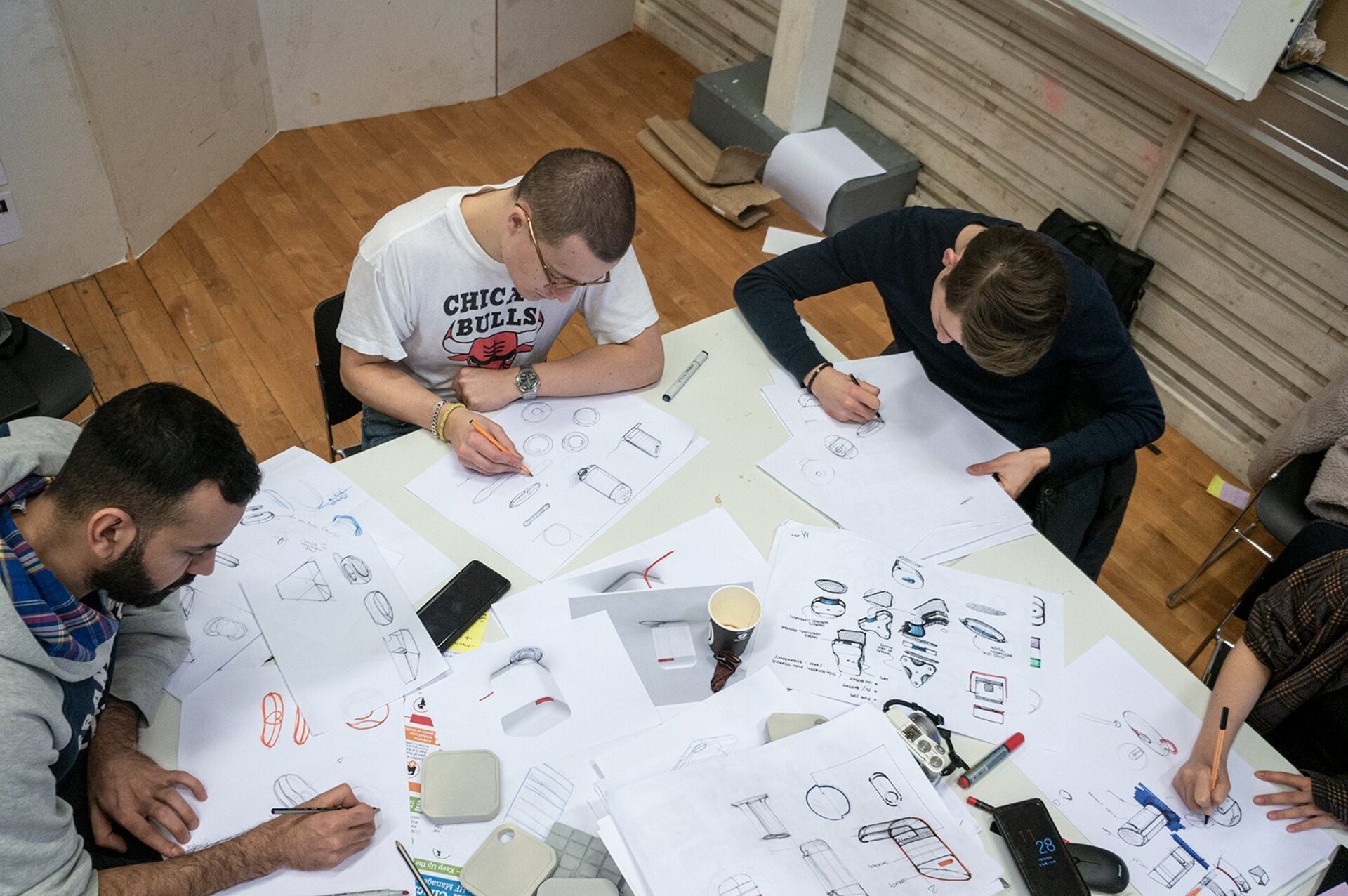
Grocery Transparency App
Role: UX Researcher · Interaction Designer
People want to know what they're actually buying not just a nutrient label, but what an ingredient is, where it came from, whether it aligns with a health concern they actually have. The existing tools for this are either too technical, too incomplete, or too much effort for a person standing in a supermarket aisle with three minutes to decide.
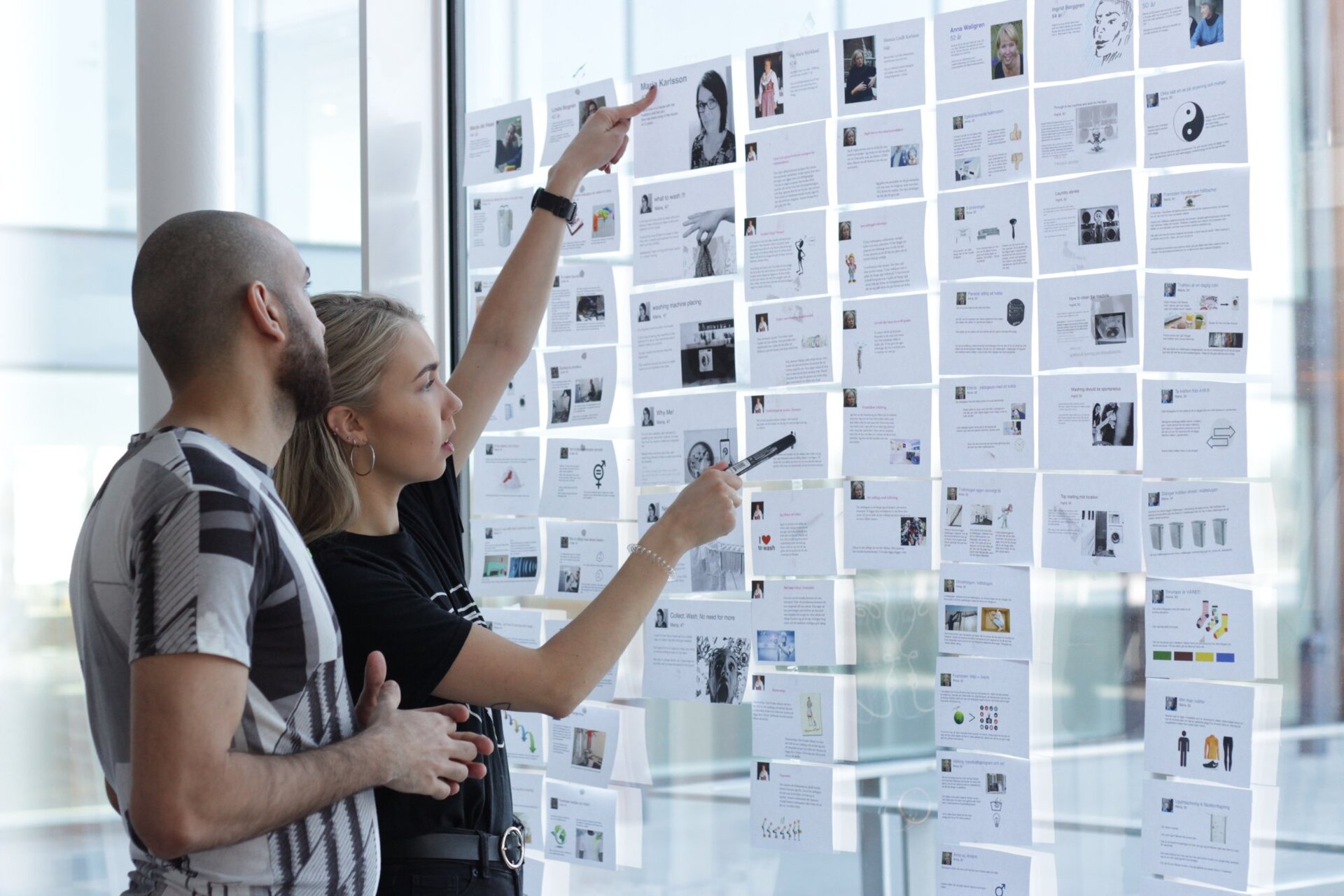
This project was one of the most research-intensive I've run: 9 co-design workshops and a 57-person field study across different demographics, eating patterns, and levels of health literacy. The brief was to understand the transparency gap what people actually want to know versus what they're currently able to find out and to design a tool that closes it in a moment of real purchase intent.
The result was an app concept grounded not in "here is the data" but in "here is the answer to the question you actually have." The distinction sounds small. The design difference is significant.