A screen three times wider.
A system that had to think differently.
A flagship vehicle. A new cabin experience. A 3D operating system built in Unreal Engine, designed from the first hand sketch to the production car. This is how we shipped it, and where I led.
The role
Design lead. Senior UX/UI.
Design lead. Senior UX/UI.
Motion design.
I led the OS work end to end and stayed on the tools the whole year. Interface in Figma and Adobe. Blender for 3D prototypes and render tests in the cabin. Motion design for the exterior lighting when that team needed a hand.
The team I led
29
people, across four disciplines.
8
UX & UI designers
6
Developers
3
Blender & motion designers
12
Unreal Engine developers
Aligned with
Interior design
Exterior design
CMF
Brand
Four sibling teams owned pieces of the car I did not. Interior owned the physical cabin. Exterior owned the body language. CMF owned the materials and finishes. Brand owned the voice. The OS had to sit alongside all of them, without stepping on any of them.
Timeline
Almost a year. Concept to production.
Outcome
Shipped in the Lynk and Co 900. Sold in China today.
The project at a glance
A year of work,
A year of work,
in six chapters.
Almost a year with the team. Six phases, from the first briefing to the show. Research shaped the brief. The brief shaped the concept. The concept became a system, then a shipped OS, then a car on the Shanghai floor.
Chapter 01
Discover
Weeks 1-6
Ran alignment workshops with the design team. Interviewed users across Sweden and China. Built six personas together from real people.
Chapter 02
Insight
Weeks 6-8
We read the research together. Named the divide between digital natives and analogue drivers. It rewrote the brief.
Chapter 03
Define
Weeks 8-14
Ran stakeholder workshops with brand, engineering, and product. Designed the touchable home screen with the team. Four rounds of Figma tests.
Chapter 04
Concept
Weeks 14-24
The deepest hands-on chapter. I led the invention of the 360 camera framework. Shaped the brand direction with the brand team. Built the 3D foundation with the motion designers.
Chapter 05
Build
Weeks 24-44
Hands on the tools with the team. Figma. Blender. After Effects. Unreal. Twenty-nine of us built the design system from zero.
Chapter 06
Ship
Weeks 44-52
Handed the work to production. Reviewed every release with the team. Set up the design community for the next generation.
The thread traces where I stayed hands-on Peak marks the deepest hands-on moment
01
The brief
A screen three times wider.
A system that could not keep up.
The brief looked simple. Design the operating system for the next flagship.
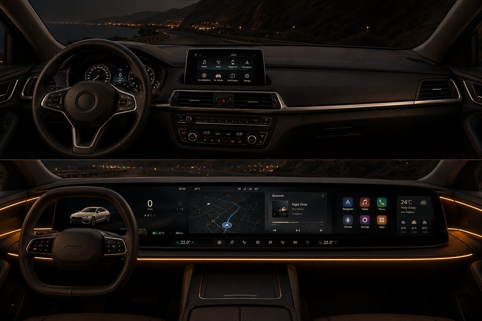
Then the numbers arrived. A screen three times wider than anything we had shipped. Four screens in the cabin, not one. A six-seat family, three rows. Every pixel live in three dimensions, in Unreal Engine. None of this had been done in a production car.
The cabin as one system
Four surfaces. One design language. One OS running live across all of them.
DIM
Driver Information Module
The instruments. Speed, range, warnings. The driver's peripheral vision.
CSD
Center Stack Display
The wide 32:10 canvas. Shared by driver and passenger. The heart of the cabin.
HUD
Head-Up Display
Projected on the windshield. What the driver needs at speed, without looking away.
RSE
Rear Seat Entertainment
Folds down from the ceiling. Same canvas as the front. For the family in the back.
The real transformation
Not just bigger.
Not just bigger.
Three‑dimensional.
2D interface
Live 3D · Unreal Engine
The real shift was not size. It was depth. A whole design system, built in three dimensions. Every menu, every state, every transition, rendered live in Unreal Engine. Not a car with 3D moments. A car with a 3D operating system.
The product brief
A whole new cabin operating system.
01
The cabin
Four surfaces, one design system. DIM. CSD. HUD. RSE.
02
System
Not an evolution. A rebuild from zero.
03
Technology
Live 3D. Unreal Engine. Every frame at production fidelity.
04
Identity
Upgrade every feature. Keep the DNA.
The market brief
Built for the most demanding buyers on earth.
01
Users
A family flagship. Every seat is a user, not just the driver's.
02
Competitors
NIO
Xpeng
Tesla
03
Expectation
Chinese buyers use the most advanced tech on earth. The car had to match.
04
Position
Built around its digital experience. Not a car with screens bolted on.
02
From concept to production
A natural continuity.
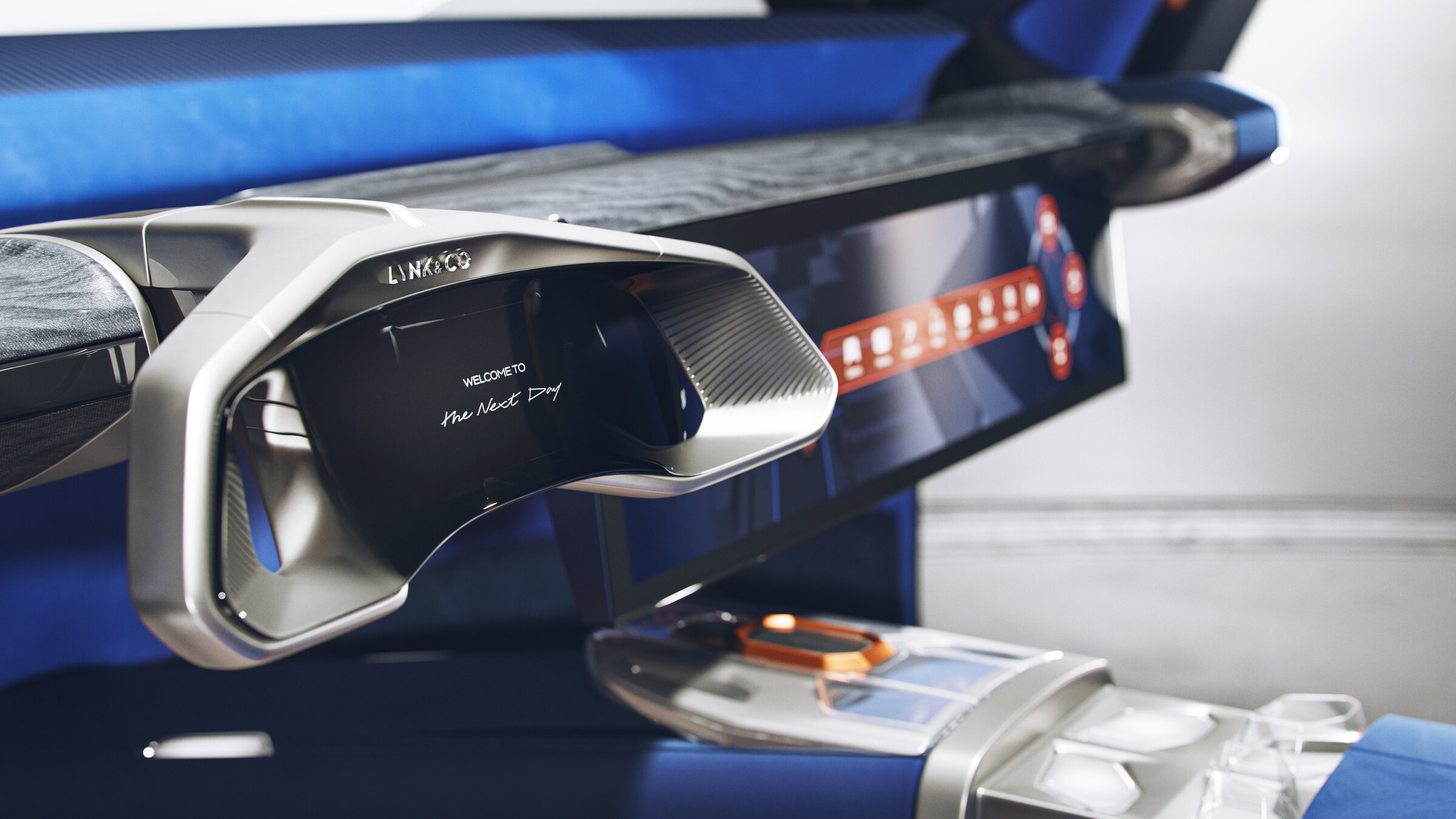
Before the 900, there was the concept car. I led the cabin interface, from first sketches to the show car in Shanghai. The reveal landed. Press covered it. Lynk and Co decided to build it for real.
When production started, I stayed on. That continuity is rare. Concept work usually loses something on the way to production. Keeping one designer through both phases meant the original intent made it into the car.
And the world reacted
Coverage across design outlets, automotive media, and China's specialist car press. That response is what made the production version real.
Lynk & Co unveils the dramatic "next day" car concept
ConceptLynk & Co's 900 Has Two 30-Inch 6K Screens And Up To 845 HP
ProductionTech-packed SUV with rotating seats challenges premium rivals
ProductionLynk & Co 900 opens pre-sales at 330,000 yuan, 40,000 orders in weeks
ProductionAll-new flagship six-seat SUV debuts on SPA Evo architecture
ProductionA selection of coverage. Real headlines from published outlets.
03
Methods, team alignment
Before designing anything,
everyone needed to be aligned.
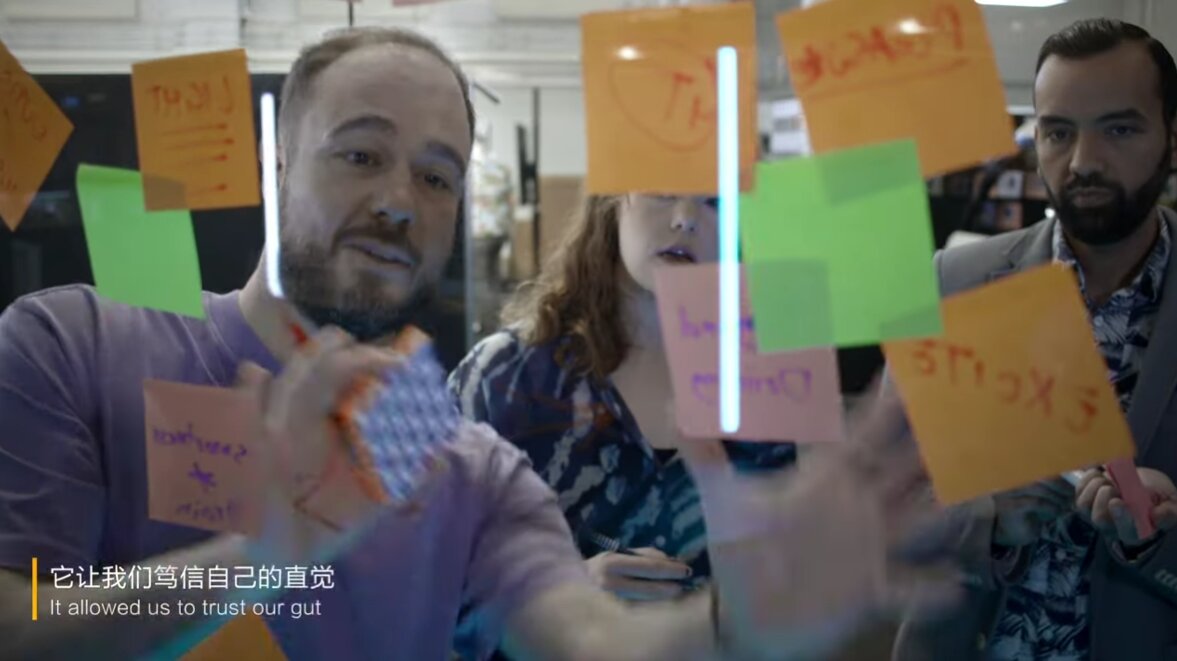
Week one. Design team in the room. I ran a workshop using methods I trust from teaching at Umeå University. Each one does a specific job. Together they made sure nobody left with a different picture of what we were building.
Method 01
Lotus Blossom
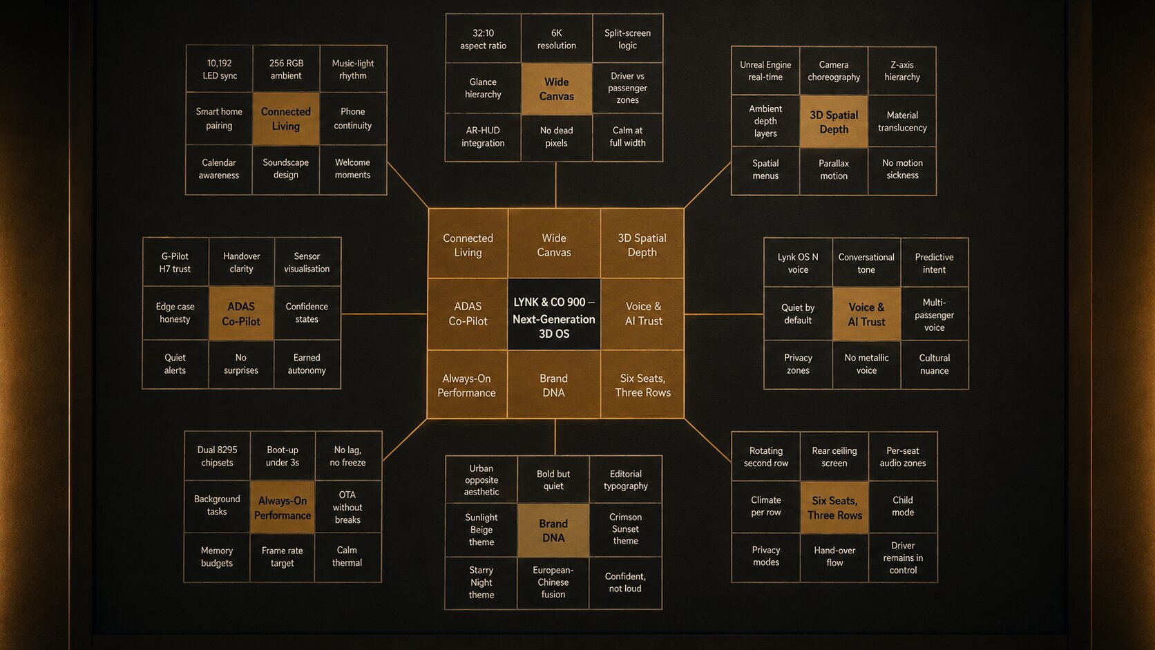
One core problem in the middle. Eight sub-problems bloom around it. Then eight more for each. The pattern forces depth.
Method 02
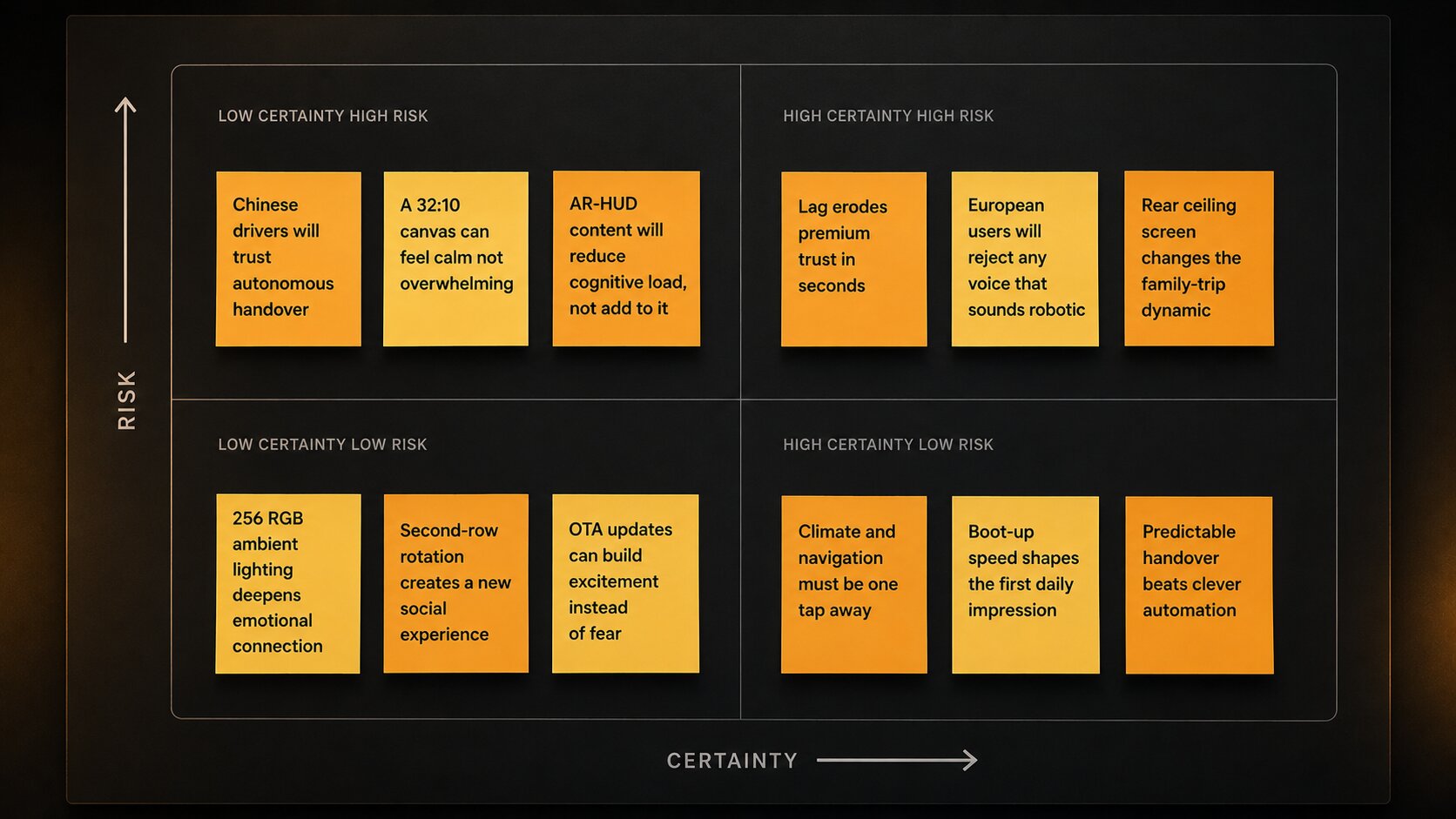
Assumption Mapping
Every belief on a note. Sorted by certainty and risk. The disagreements came up fast.
Method 03
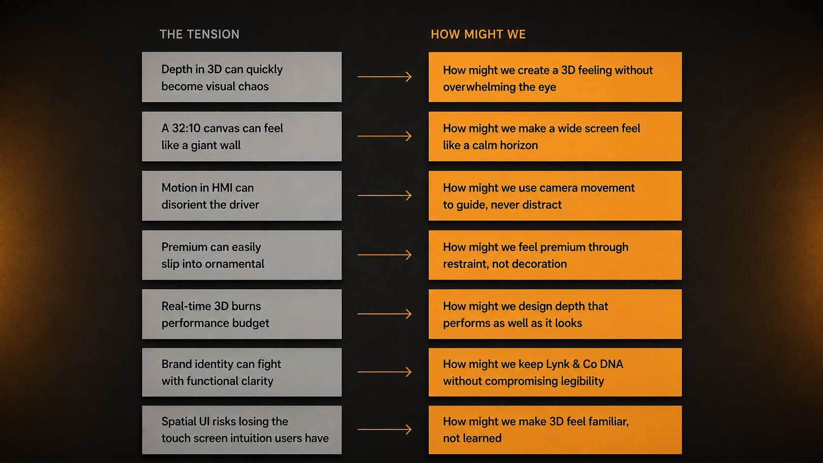
How Might We
Every tension became a question. "The 3D transition is complex" became "how might we make it feel seamless." Small grammar shift. Big design shift.
Method 04
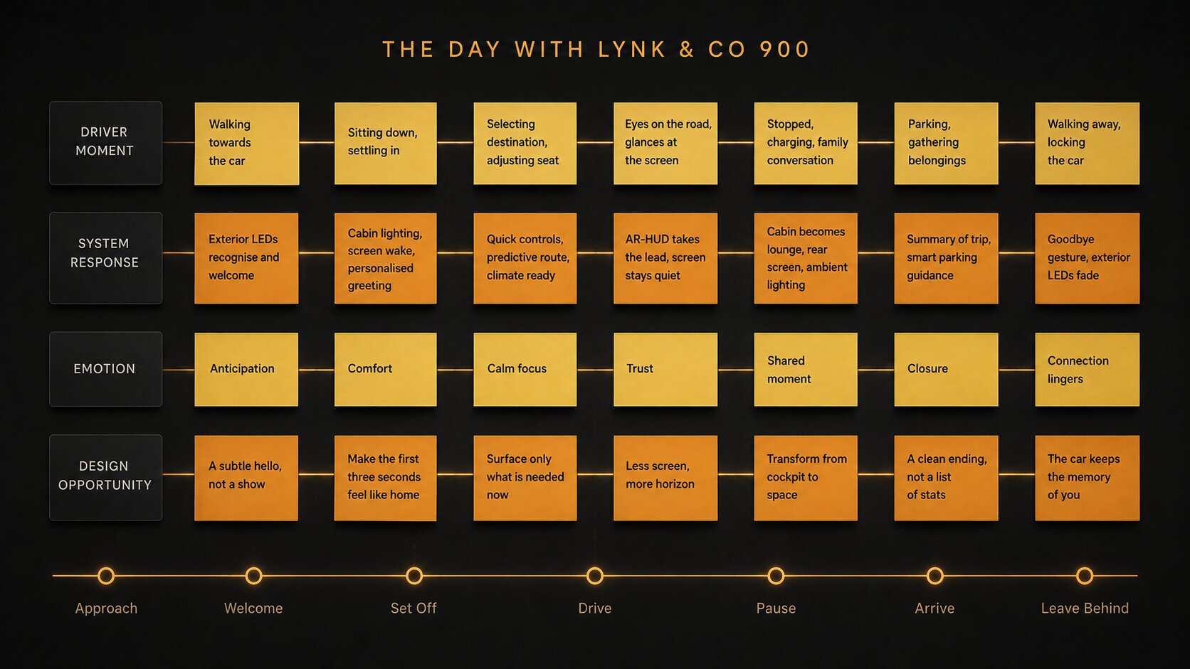
Future State Journey Map
The user's whole day, mapped. Before any screens existed. The picture on the wall became what we designed toward.
Visuals recreated for confidentiality. The content, methods and outcomes are from the real workshops at Lynk and Co.
04
Stakeholder alignment
Brand, engineering, product, management,
and VQM from China, all in one room.
Different backgrounds. Different definitions of success. A second workshop, this time with stakeholders and our China partners at VQM, so everyone was pointing the same way before any design started. The hard conversations were going to happen anyway. I wanted them in this room, not at production handover.
Method 01
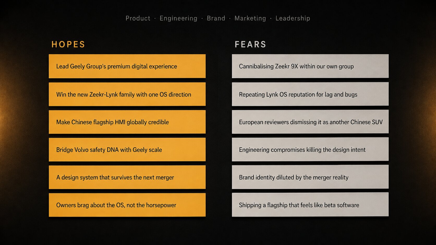
Hopes and Fears
Each stakeholder wrote what they hoped for. And what they feared. The expectations and anxieties came up before they became blockers.
Method 02
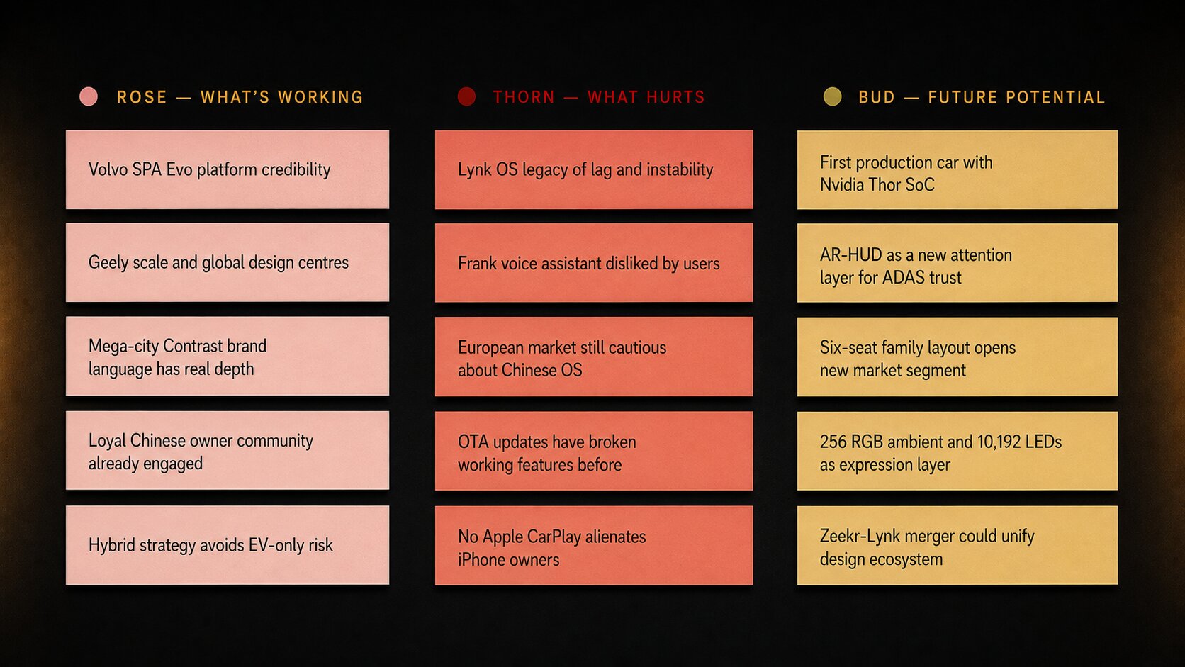
Rose, Thorn, Bud
What is working. What hurts. What could grow. Three simple questions. Powerful for aligning a mixed room quickly.
Method 03
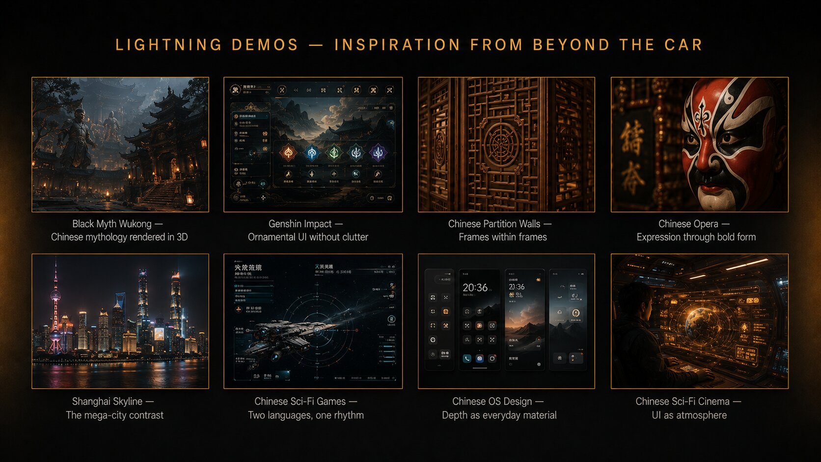
Lightning Demos
Stakeholders shared inspiration from outside cars. Chinese craft. Gaming. Mega-city aesthetics. We broadened the reference frame.
Method 04
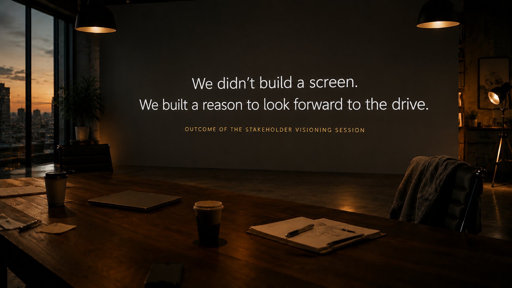
Visioning Session
Each stakeholder described what success looks like in two years. We mapped it together. Then worked backwards from there.
Visuals recreated for confidentiality. The content, methods and outcomes are from the real workshops.
05
Field research
Field research in Sweden and China.
The team studied reviews and walkthroughs of every premium SUV in the segment, in both markets. We mapped what each brand was getting right and where they fell short. What we wanted was a clear picture of where Lynk and Co could lead, not just where we could match.
Field research, competitive review
Competitive field research across premium SUVs in Sweden and China.
06
Personas
Real people, before any journey was drawn.
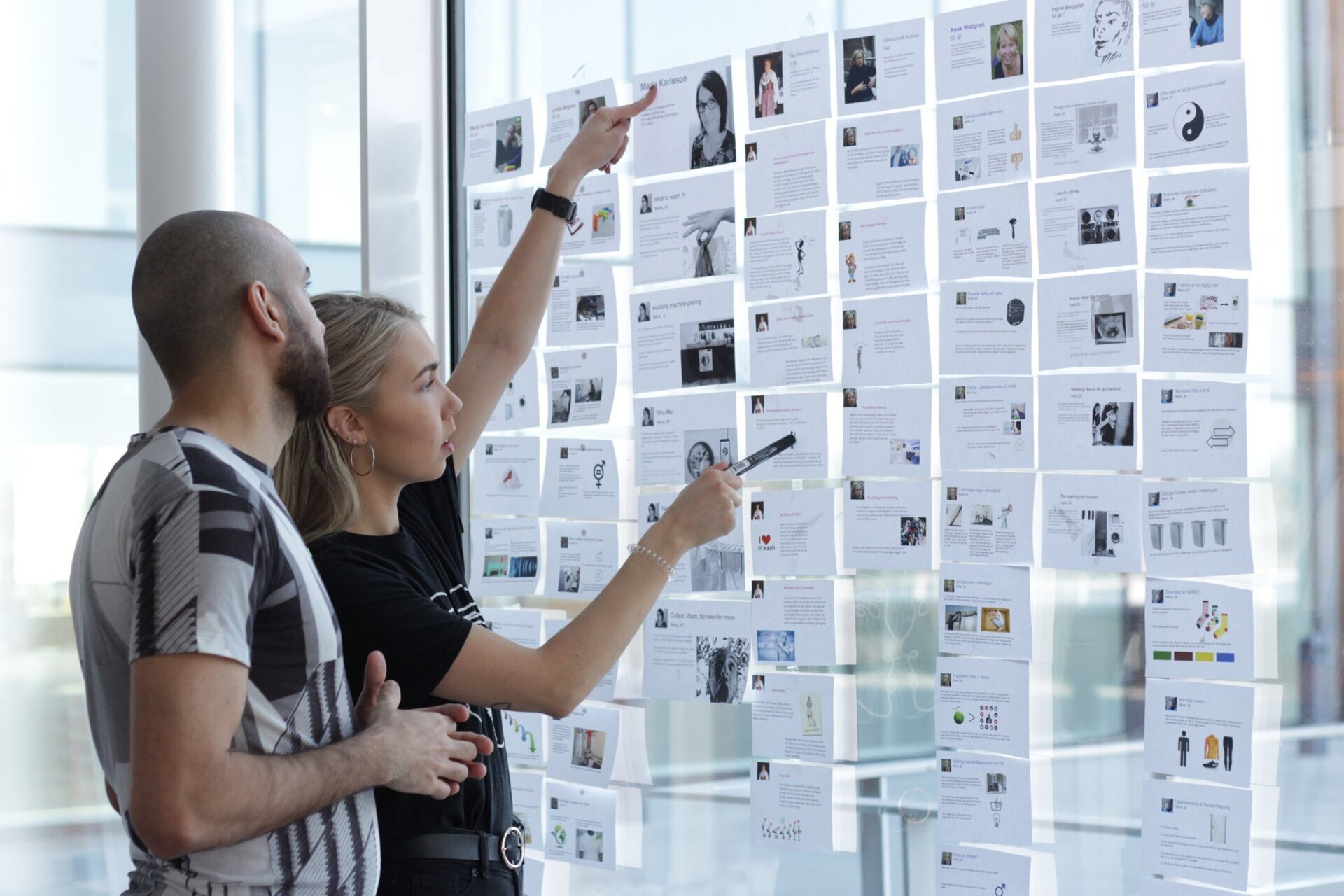
Personas are not a research deliverable. They are the lens that shapes every decision that follows. We built six distinct personas from real users. Real photos, real quotes, real daily habits. So the team could see who we were designing for every time we walked into the studio.
Six personas, not one user. The daily commuter. The family traveller. The long distance driver. The city explorer. The weekend escape. The digital native. All real members of the Lynk and Co car club, not invented archetypes.
We printed them and pinned them on the wall. The team passed them every day. The personas stayed alive in conversation, not buried in a PDF nobody opens.
07
Ethnographic journey mapping
Not assumptions. Lived days.
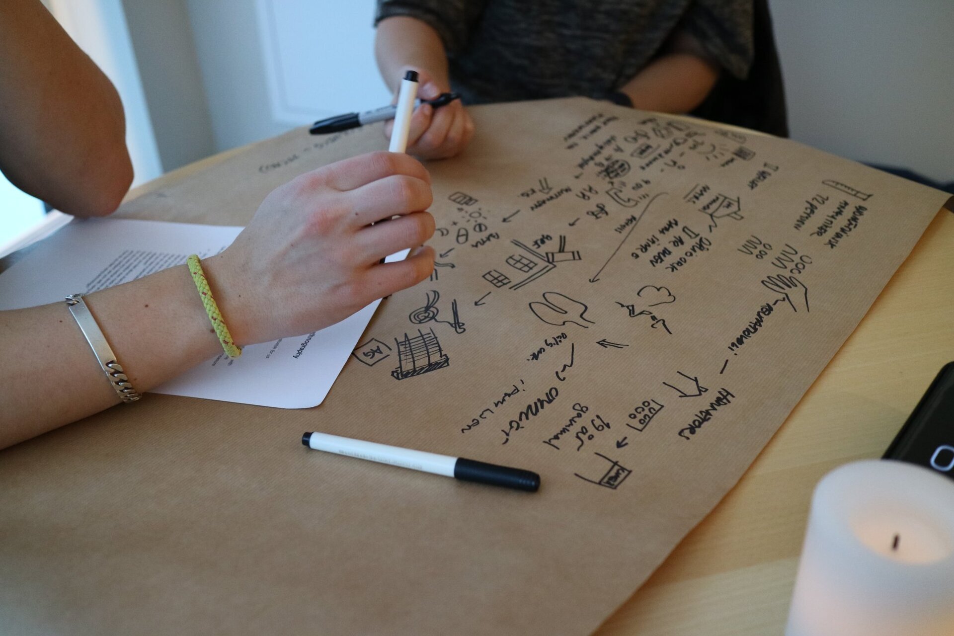
Most journey maps start with assumptions about what users do. We started with their full day, mapped together with them in real time. The interview itself became the design tool.
Step 01
Persona segmentation first
I set the research up around persona segments first, so each group was studied in their own context. The daily commuter and the long distance driver were not interviewed the same way.
Step 02
Ethnographic depth interviews
Participants narrated their full driving day from morning to night. We kept probing on motivation and mental models, not just observed behaviour. The touchpoints surfaced over time.
Step 03
Live co creation of the map
We drew the journey visually as they spoke. When they could see their own day, they corrected it, refined it, surfaced things they would never have said out loud. Bias dropped.
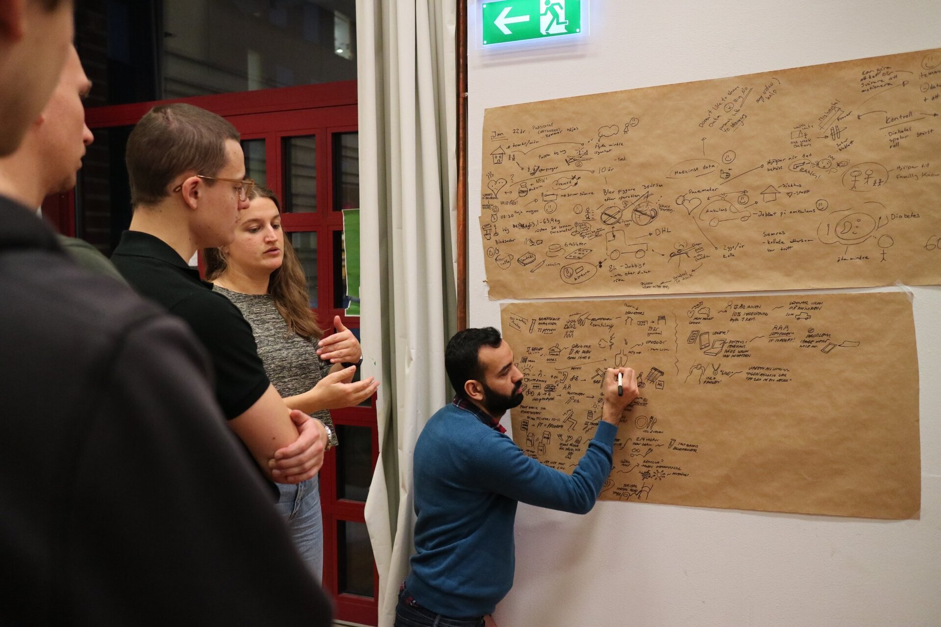
Six personas. Thirty two interviews. One shared picture of the day with Lynk and Co.
08
The power of the method
When touchpoints overlap,
the real pain becomes visible.
This method becomes most powerful when multiple stakeholders share the same information from different angles. The gap between what each person sees is where the real problems live. The clearest version I have run sits outside automotive. I include it here because the same shape drove the Lynk and Co cabin work.
Heart failure device, MedTech
Patient and hospital, two views of the same day.
The patient tracked daily symptoms, took medication, lived with the condition. The hospital monitored data remotely, scheduled check ins, responded to alerts. Mapping where their touchpoints met revealed missed information windows. The system was losing patients in the gaps.
Lynk and Co 900, automotive
Driver and passenger, two views of the same cabin.
The driver: approach, set off, drive, pause, arrive. The passenger: entertainment, comfort, navigation interest, transitions between rides. Mapping where their journeys overlapped revealed shared moments where the car was failing both. The cockpit was designed for one user, not six.
Workshop, overlapping journeys
Same method. Different stakes. From saving lives to saving the first impression.
We designed for the digital native, with respect for the analogue driver.
The key insight
09
The insight
Two generations,
two definitions of premium.
The research surfaced a divide most automotive briefs would have papered over. Two clear user worlds. Each with a different mental model of what a great car experience feels like.
Generation A
Digital natives
Grew up with smartphones. Expect the car to know them. AI is not a feature for them, it is the baseline. They glance, swipe, speak. They are forgiving of complexity if it feels intelligent.
Generation B
Analogue drivers
Built habits with manual cars and physical buttons. They want predictability over surprise, reliability over novelty. They trust what they can feel, see and hear without thinking.
We designed for the digital native, with respect for the analogue driver. That is where the target market is. That is where the world is moving. A year ago ChatGPT was a wizard tool. Today everyone uses it. The bar moves fast. The car has to move with it.
10
What the research changed
Three findings that
rewrote the brief.
The research did not just confirm what we suspected. It rewrote the brief in three specific places.
Finding 01
Icon placement
Drivers do not navigate cars like cars anymore. They navigate them like smartphones. The hierarchy had to be built for the eye trained by ten years of iOS, not the eye trained by a previous generation dashboard.
Finding 02
Touch navigation
A decade of smartphone habit shapes every interaction. Drivers expect tap targets, swipe gestures, predictive defaults. The 3D system had to honour those habits, not retrain them.
Finding 03
AI expectations
Users expected the car AI to feel like the AI in their pocket. Conversational. Contextual. Patient. The bar was set by ChatGPT, not by previous car assistants.
11
From research to system
Every layer of the OS
traces back to research.
The research did not stop at a report. Each finding pushed one specific decision. Each decision became a layer in how the OS was built. This is why the interface looks and feels the way it does today.
-
04
Touchable 3D home
A live 3D car, ready to your hand. What all the other layers land on.
Rooted in journey mapping. Users wanted the car itself, not a menu.
-
03
Conversational AI
The car listens like the phone in your pocket. Full sentences. Not commands.
Rooted in Finding 03. The bar was set by ChatGPT, not previous car assistants.
-
02
Gesture language
Tap. Swipe. Predictive default. Ten years of iOS, honored not retrained.
Rooted in Finding 02. The smartphone habit was already there.
-
01
Grid hierarchy
Icons on a grid the eye already knows. Never scattered like a dashboard.
Rooted in Finding 01. Drivers now navigate cars like smartphones.
-
00
Two-mode foundation
Digital native or analogue driver. Same OS. Two faces. The system adapts to the person.
Rooted in the key insight. Two generations, two definitions of premium.
Every layer earned its place through research. Nothing in the OS is decorative.
12
Define
The screen followed
the research.
The architecture set the shape. What lived inside it, we still had to decide. The journeys told us what people wanted quick access to. The findings told us the hierarchy their eye already knew. Every screen decision, from the landing page to the media room, came from something the research surfaced first.
Decision 01
The landing page as a car you can touch
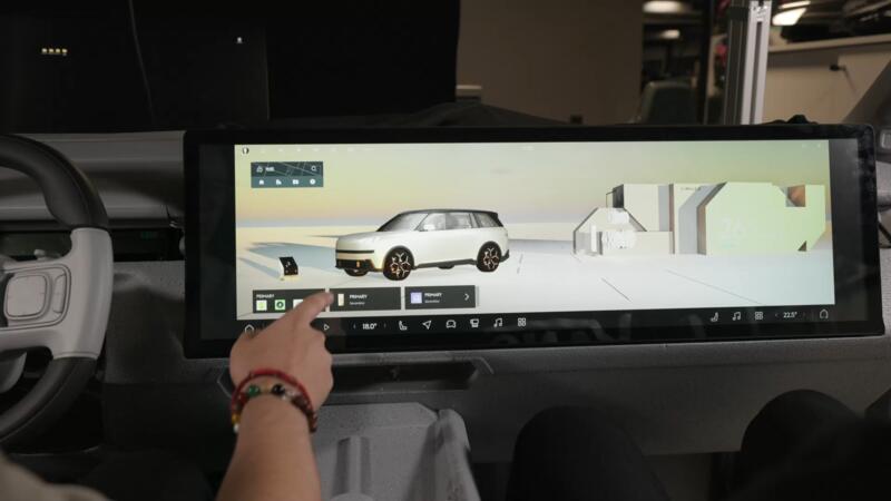
The journeys showed users wanted quick access to the physical car. Seats, climate, doors. So the home screen became a 3D car you can touch and click. Seats are seats. Climate is climate. The interface is the car.
Decision 02
Media as community
Users described driving as their alone time, their social time, their family time. We built Club, a media space that recognises the car as more than a player. It is the room you are in.
Decision 03
Icon placement, iOS-first
Finding 01 was clear. Drivers navigate cars like smartphones now. So the home grid honoured the eye trained by ten years of iOS, not the eye trained by a dashboard.
Decision 04
Four rounds of Figma AB
Hierarchy tested with Lynk and Co car club members in Figma prototypes. Four rounds. Each iteration narrowed what mattered and removed what did not.
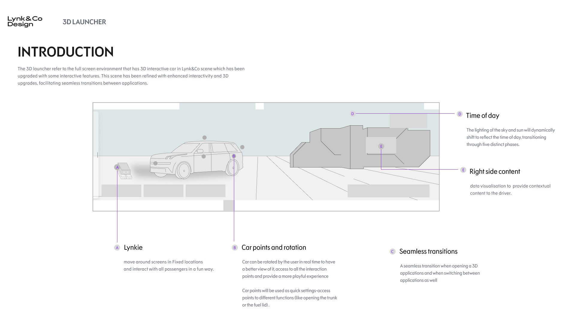
3D launcher specification. The home screen as a touchable car.
13
The two phases
First in 2D.
Then translated into 3D.
Building the launcher in 2D first was a design call, not a delay. Hierarchy, priority, and the look and feel had to land before we spent time on depth. Once the framework held, we lifted the whole system into live 3D in Unreal.
Phase 01 · Weeks 1 to 14
Framework in 2D
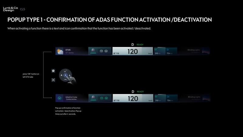
DIM, HUD, CSD and PSD wireframes. Around seventeen apps sketched. The frame that held the whole cabin. Reviewed in cycles with VQM, our stakeholders in China.
- Status bar and bottom bar behaviours
- Driver only launcher versus driver and passenger launcher
- ADAS floating window, quick drawer, media, energy, climate
Phase 02 · Weeks 14 to 24
Lifted into 3D
Same system, same hierarchy, now with depth. Figma to Blender to Unreal. Live prototype the room could touch. Every state rendered in real time.
- Main launcher with real-time weather and five times of day
- Seamless transitions into Climate, Seats and Energy
- Real time data visualisation on the wide right side of the screen
Phase 01, in detail
The framework, at a glance.
Eight systems, drawn first in Figma. Each one reviewed in cycles with VQM. Only then translated into 3D. This is the shape of the hierarchy that let the 3D system land cleanly.
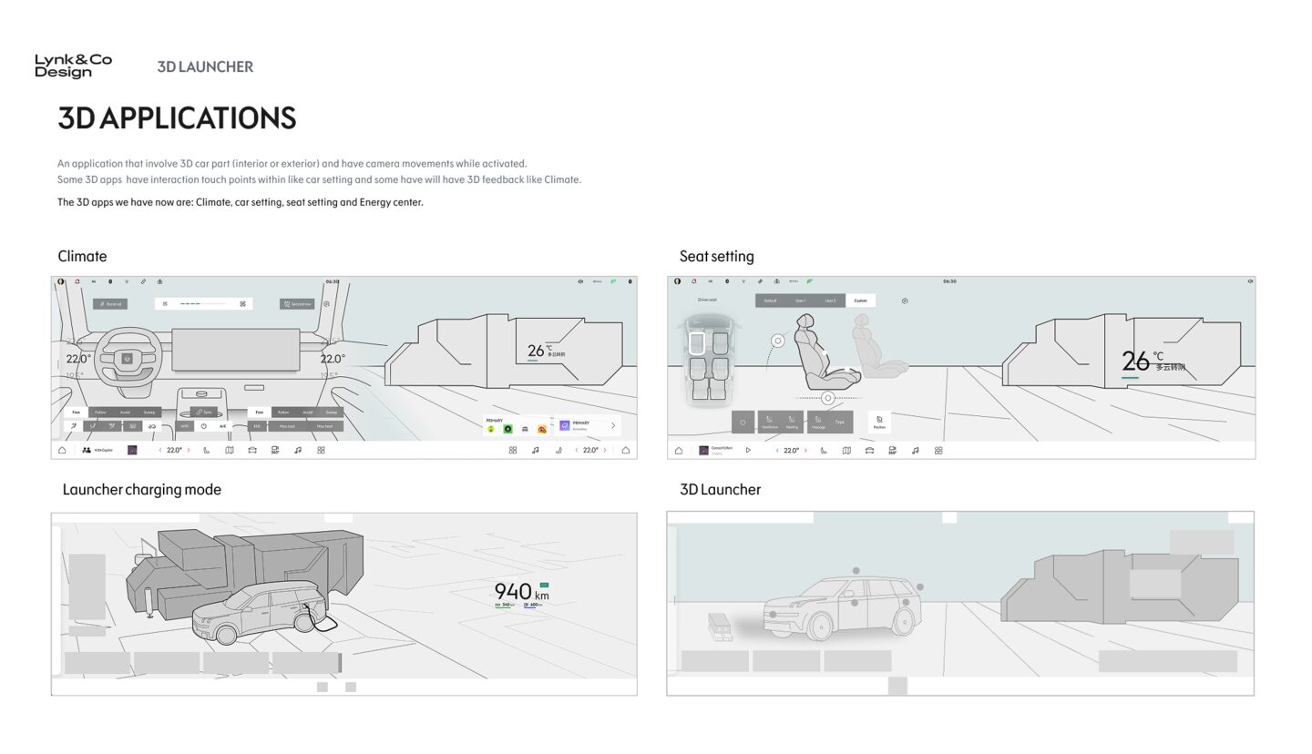
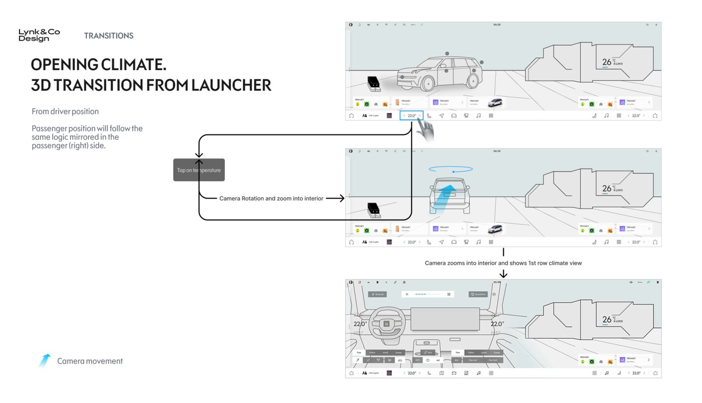
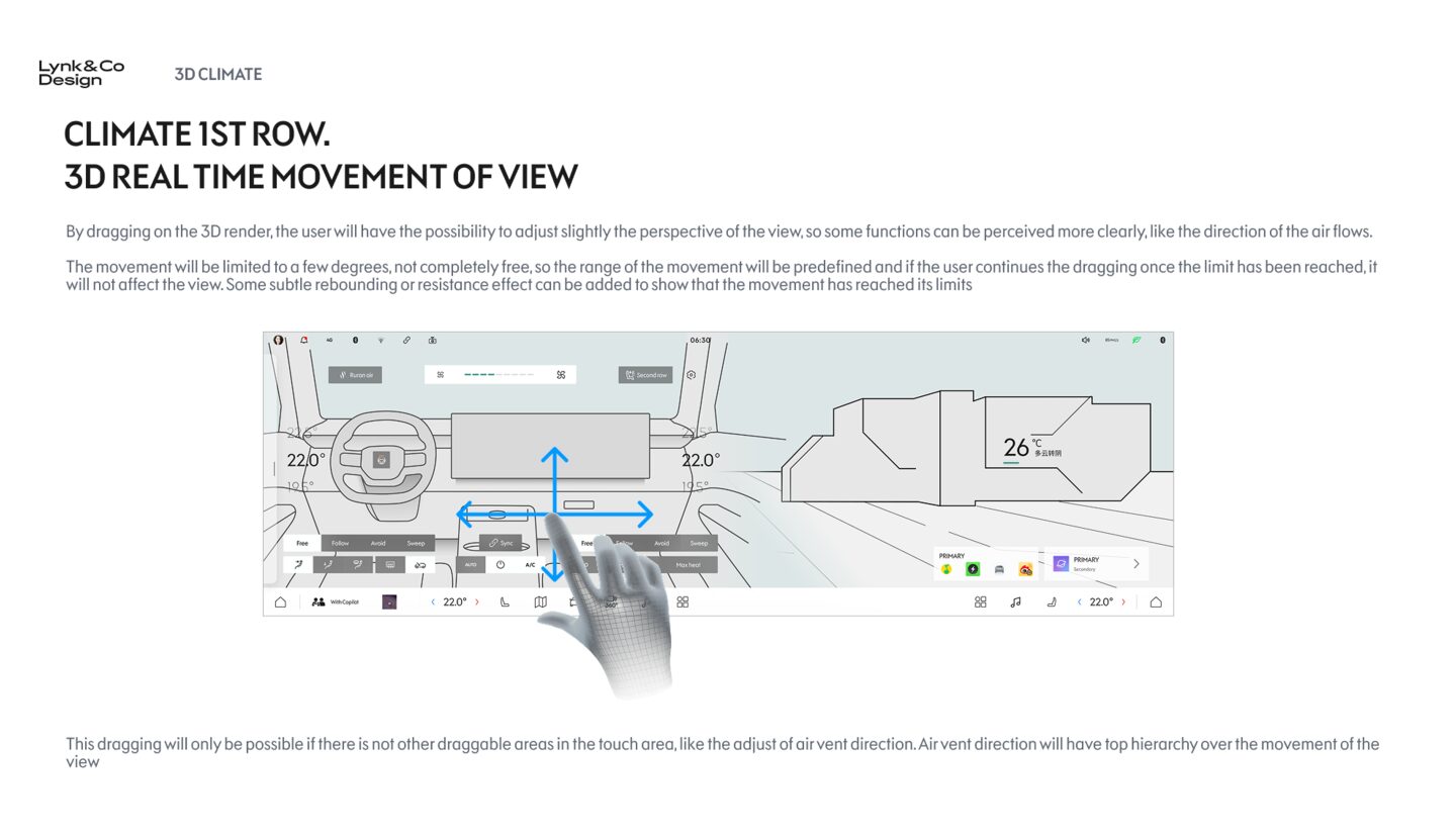
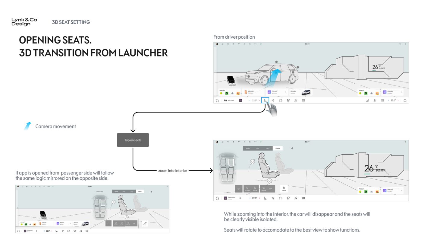
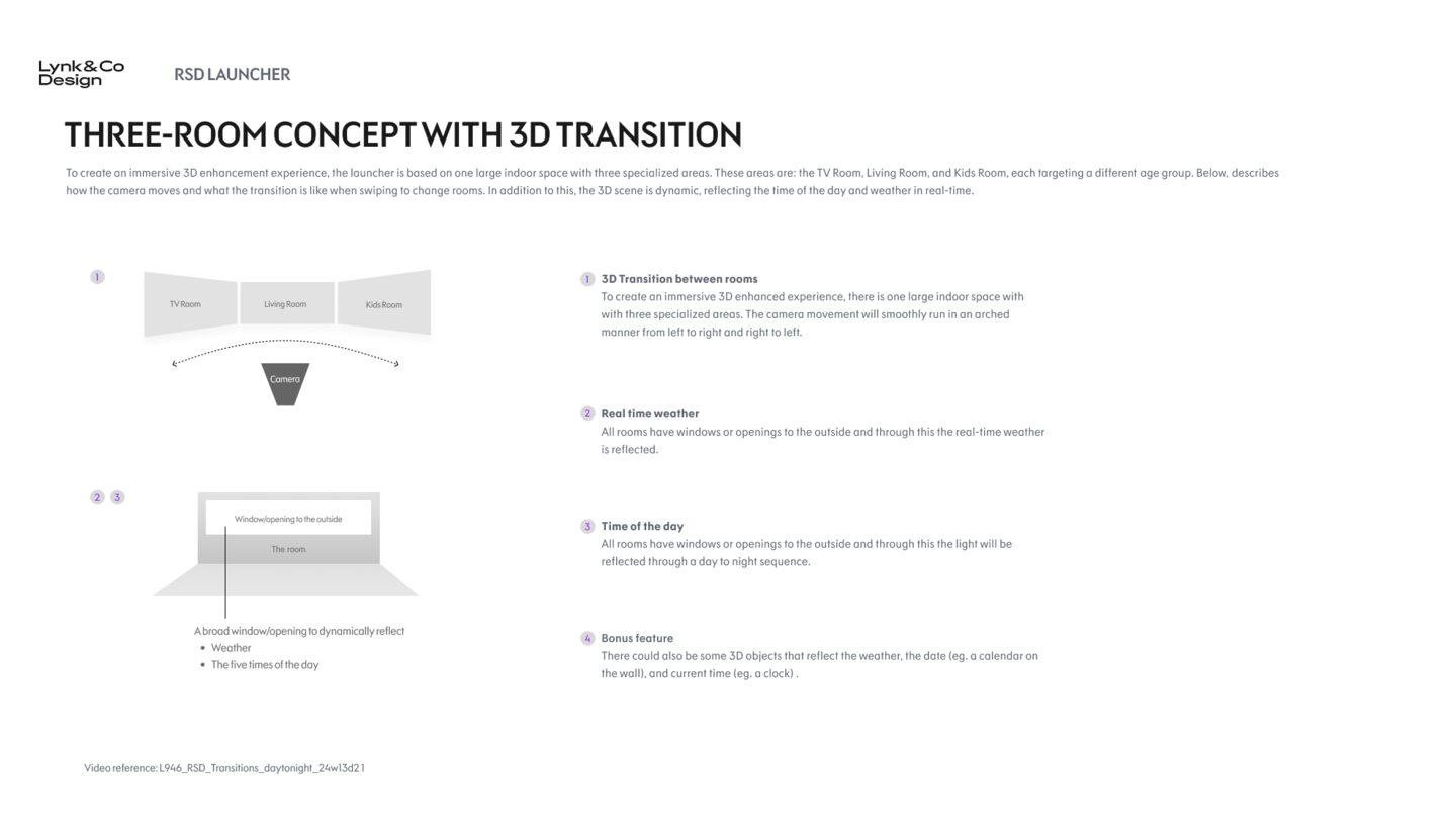
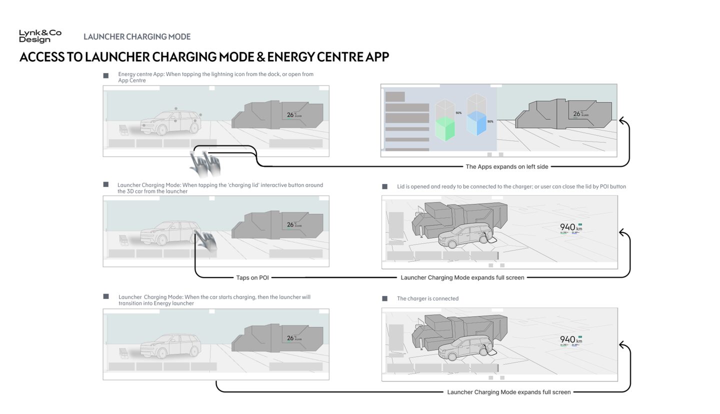
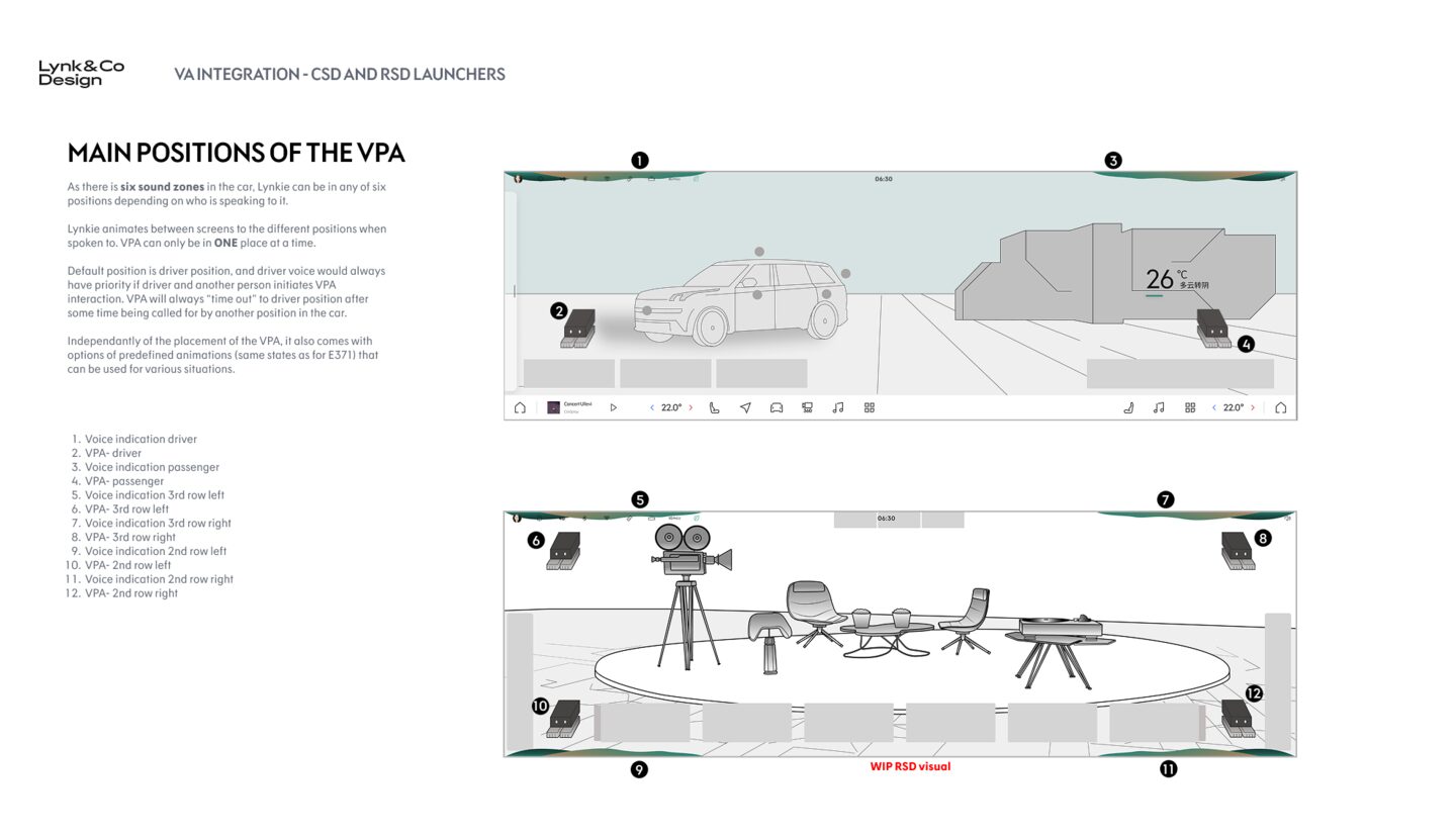
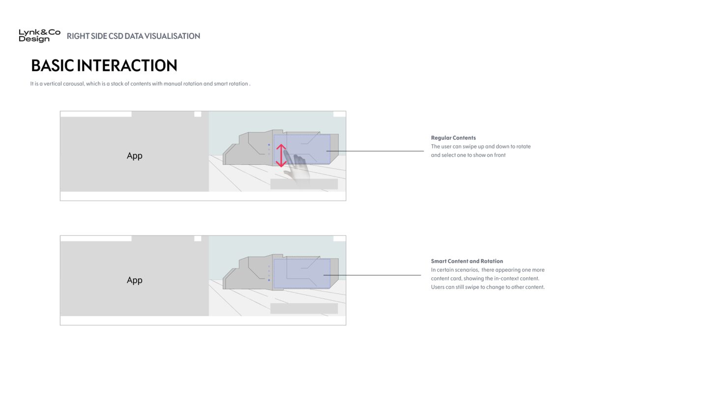
Every page went through cycles of review with VQM in China before we touched a Blender file.
You cannot design depth on top of a hierarchy that is not right. So we did not.
14
How we built it
Four tools.
One continuous loop.
A 3D OS is not built in one tool. Each step in the pipeline answers a different question. The loop runs in a specific order, and every revision sends it back to the start. This is how the 2D framework became a live 3D product.
Figma
Where every idea begins. Wireframes, hierarchy, components. The structural thinking before any depth or motion.
After Effects
First test of motion. How does the screen feel when it breathes. Pace, timing, entrance, exit. Fast iteration before the heavy tools come in.
Blender
The 3D geometry layer. Building the actual spatial elements. The car, the menus, the depth that gives the OS its identity.
Unreal Engine
Live test. The truth of the experience. Lighting, performance, interaction at production fidelity. If it does not work here, it goes back to Figma.
Figma to After Effects to Blender to After Effects to Figma. Then Unreal. Then back to the start. Every loop tightened the design.
15
Inside the process
A 360 camera
that had never existed before.
A traditional infotainment system swaps screens. Our system moves a camera through a live 360 degree environment. There was no existing framework for this in production cars. We had to invent one. Design language and technical architecture evolving in parallel.
Principle 01
Rendered live, not from a file
Every transition runs live in Unreal Engine, not as a stored video. The camera had to respond to user input instantly, smoothly, predictably.
Principle 02
360 degrees of possibility
The camera could move anywhere in the 3D cabin space. Every angle and every path was a design decision, not a default.
Principle 03
UX and engineering in parallel
A new framework meant the design language and the technical architecture had to evolve together. We were inventing both at the same time.
In 2D you change a screen.
In 3D you move a camera.
The big challenge
16
The big challenge
When a layout problem
becomes a film problem.
That single shift changed everything. The interface stopped being a layout problem and became a film problem. One that had to live inside automotive safety rules older than the screen itself.
Constraint 01
Every interaction is a journey
Climate. Seats. Music. Navigation. Each transition is a camera moving through space. Get it wrong and the driver feels carsick in their own car.
Constraint 02
Beautiful is not enough
Transitions had to be elegant at every frame, not just at the destination. The middle of the motion matters more than the end.
Constraint 03
Predictable is the new premium
A driver at 120 km an hour cannot afford a surprise. The motion language had to be learnable, repeatable, almost invisible after the first day.
Constraint 04
Designing around regulation
Automotive safety rules dictate icon placement, contrast, alert behaviour, hazard glyph positions. Decades of legacy constraints. The job was not to break those rules, but to design a system harmonic with them.
17
Physical controllers, AB tested
Two prototypes.
Twelve testers. One winner.
A 3D OS lives behind a physical control. I ran the hardware AB test with the same rigour as the software. Blind. Task-based. Four criteria. Four rounds. Every finding fed back into the next round of shapes. What survived the loop became the Rotary Vortex.
Variant A
Early prototype
- Reach 3.2
- Grip 4.1
- Click depth 2.4
- Blind operation 2.6
Variant B
Rotary Vortex
- Reach 4.6
- Grip 3.4
- Click depth 4.8
- Blind operation 4.3
The iteration loop
R1
Ergonomic shape
R2
Click depth
R3
Grip texture
R4
Blind operation
Every round narrowed the shape based on the previous round's data. By round four, the winner was obvious.
AB test prototype, Jan 2024
Final Rotary Vortex, production
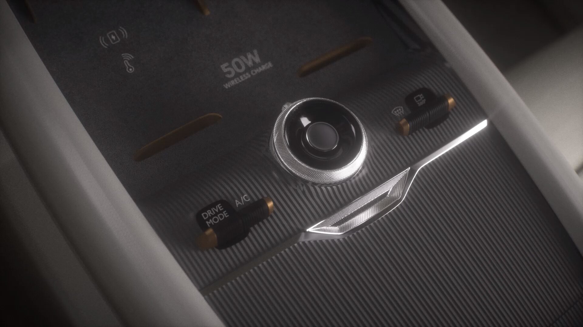
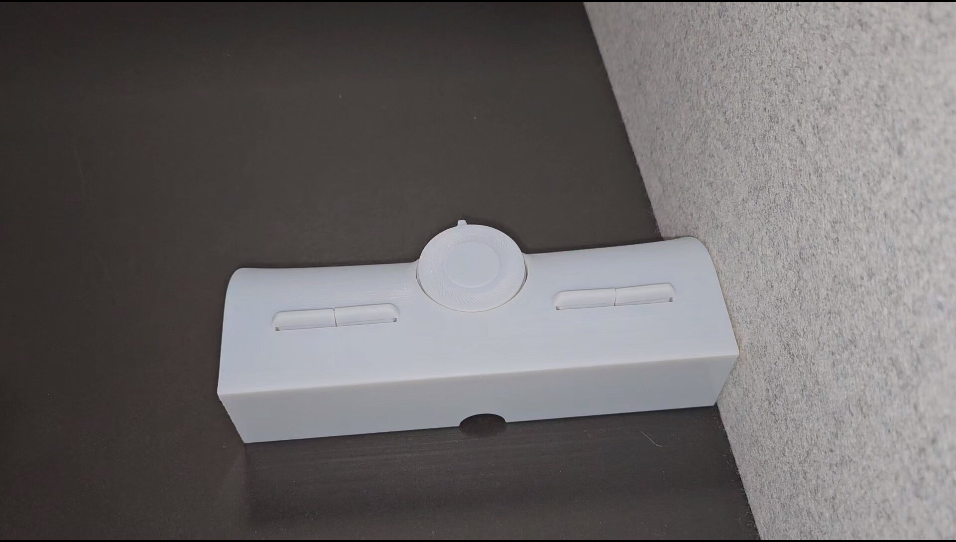
From physical test, to Figma design, to production. Every shape earned its place.
Interaction taxonomy
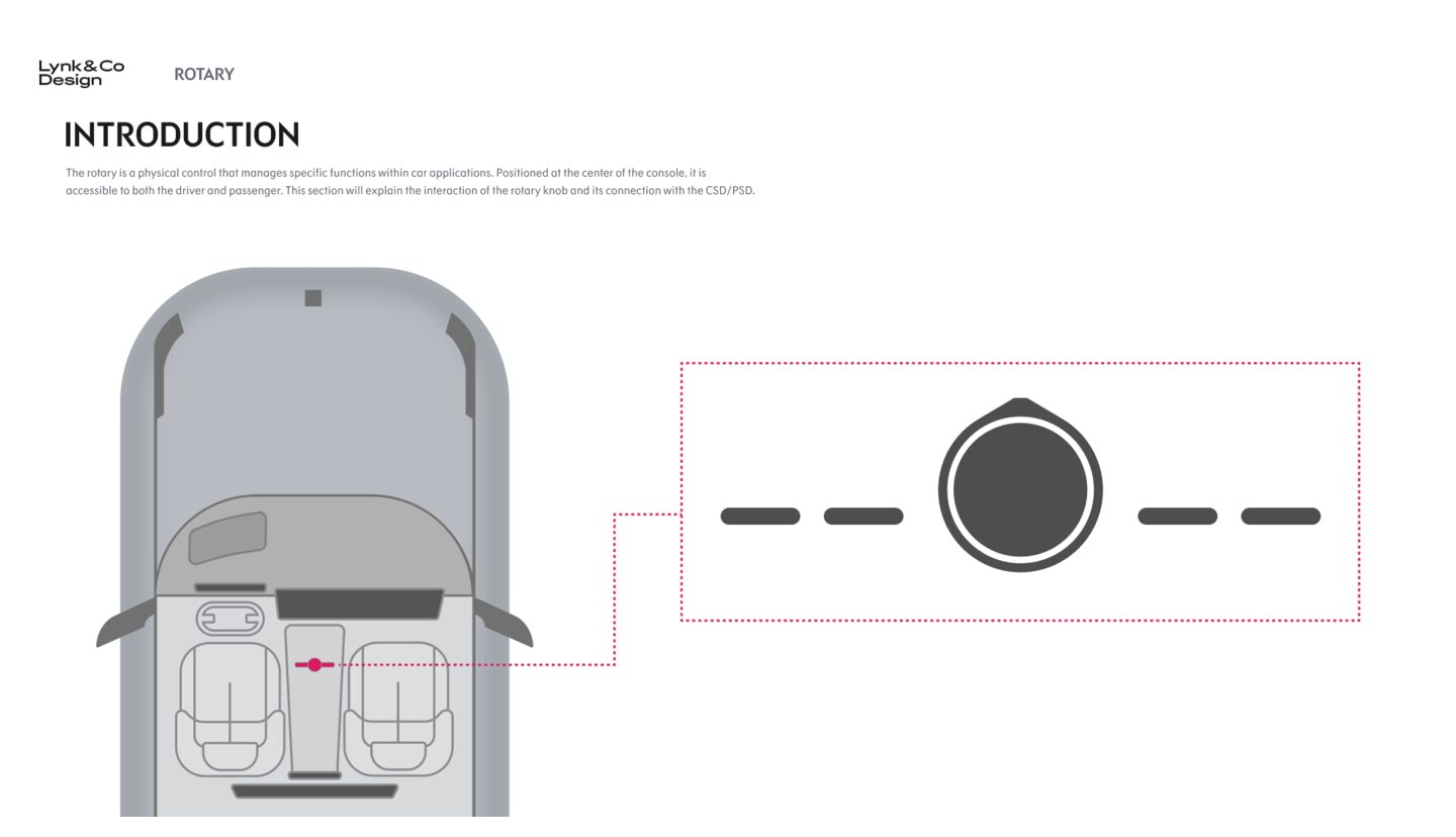
The rotary, designed on paper first.
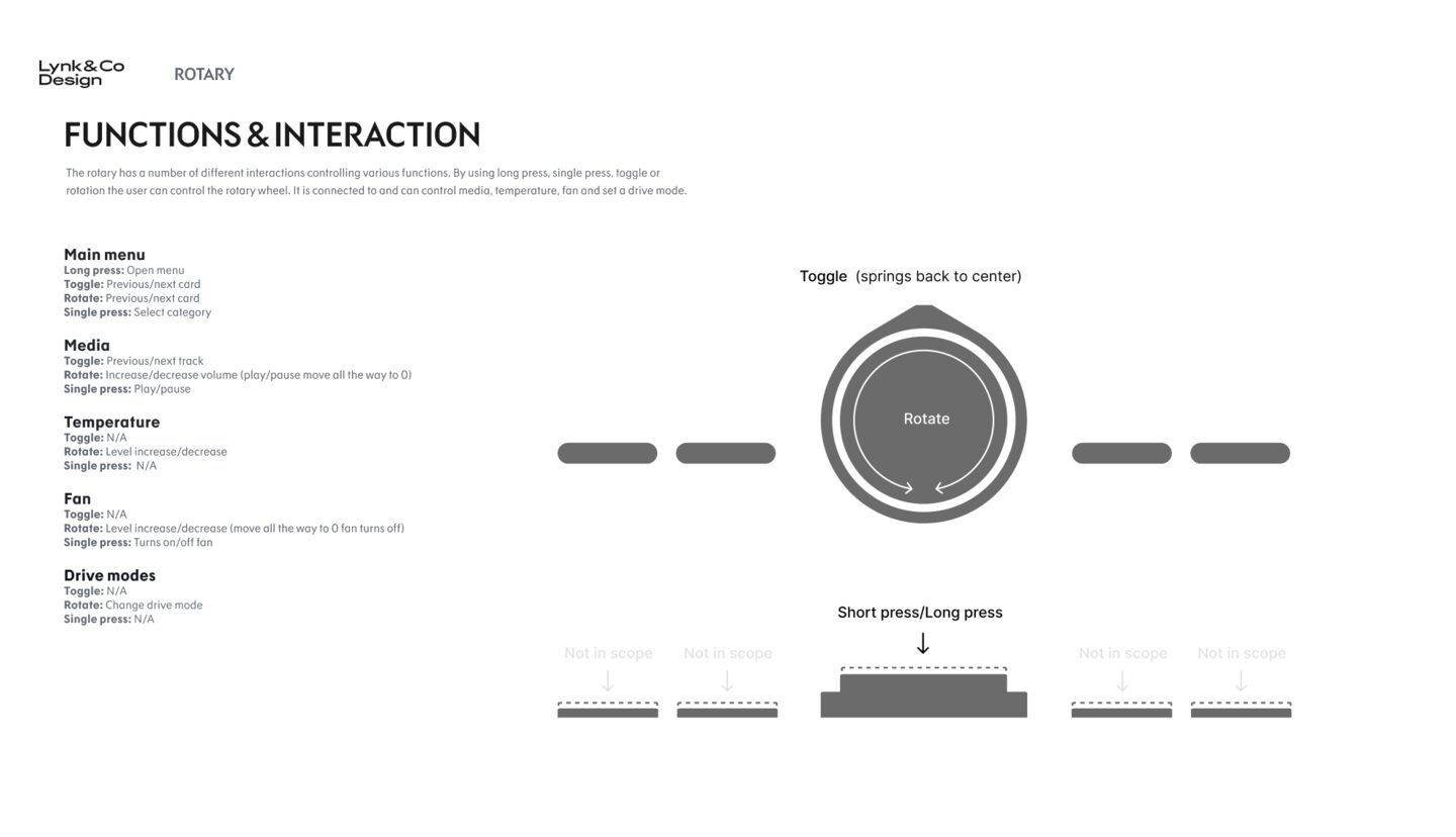
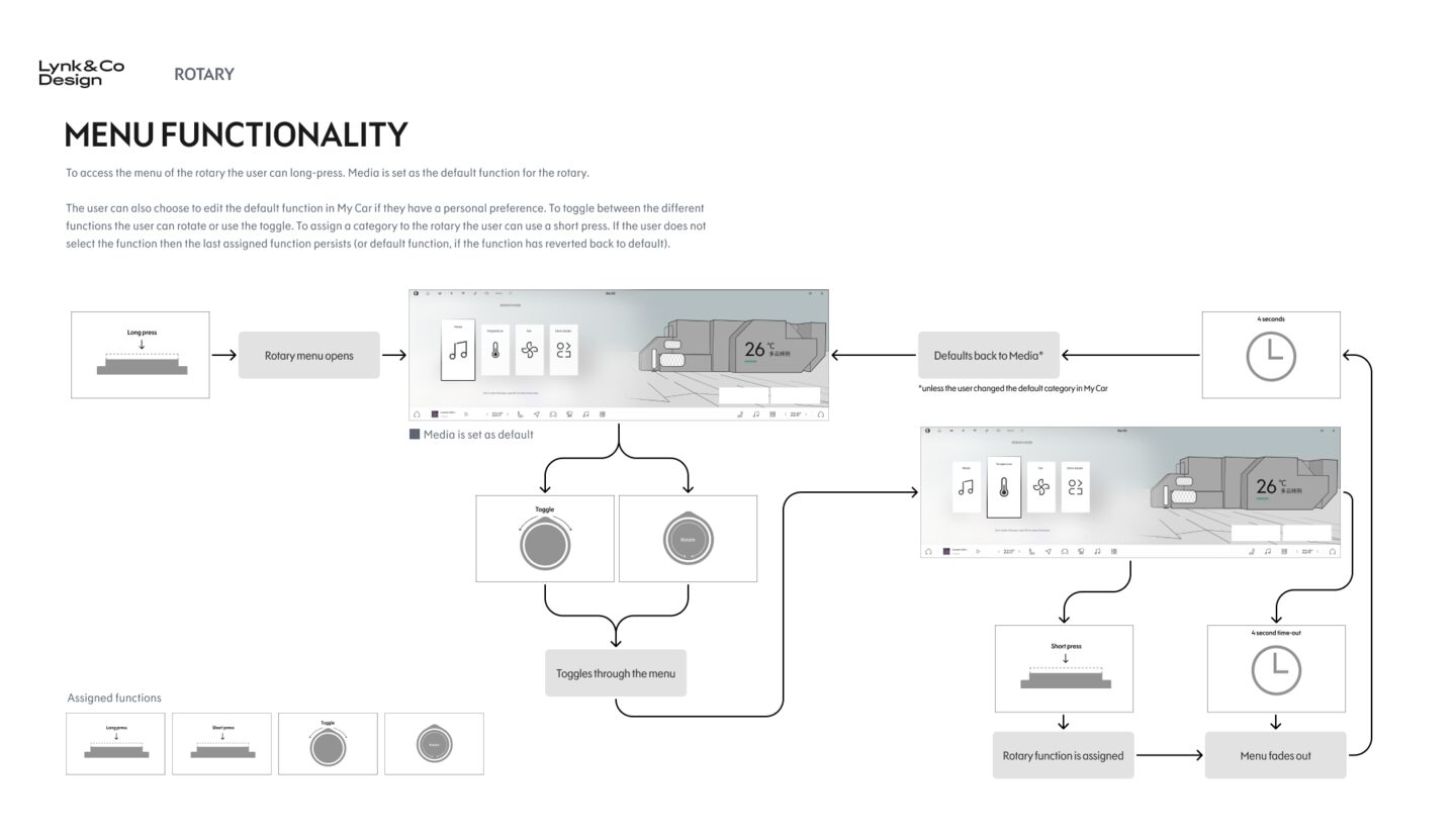
Before the shape was tested, the behaviour was defined. Long press. Rotate. Toggle. Short press. Every category of function, mapped to a specific gesture. Every gesture drawn as a flow with time-outs, fallbacks, and default states.
18
Brand direction
"The Next Day."
A morning, not a manifesto.
The brand team and I shaped the visual language together. The Next Day captures the moment when the morning sun hits a modern city. Confident, warm, alive. We had to land between Zeekr, our more clinical sibling, and the existing Lynk and Co warmth.
Tension 01
Sibling rivalry, sibling respect
Zeekr leans clinical and futuristic. Lynk and Co had to feel warmer and more human, without losing technical confidence. Two brands, one Geely family, two clear voices.
Tension 02
Mid age, with a child in the back
Our target driver has lived a few decades. Has seen tech come and go. Has people they care about in the car. Not minimal. Not crazy. Familiar enough to trust on day one, deep enough to discover for years.
Tension 03
Material translated to interface
The CMF themes, Sunlight Beige, Crimson Sunset, Starry Night Blue, became digital surface treatments. The screen became part of the cabin, not a separate object.
19
Signature features
The moments that made
the OS feel alive.
The shell was set. Then we designed what lived inside it. Signature features. Small worlds. Each with its own reason for being there.
Feature 01
Camping Mode
Immersive day and night sequences, thirty seconds each, at production render fidelity.

Feature 02
Car Wash Mode
A full cabin transformation, day and night. Not a screensaver.
Feature 03
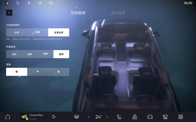
Music Visualizer
Coins that flip in time with real audio. Rain, wind, sea. Each with its own rhythm.
Feature 04
Rotary Cards
Seven new icons, plus a bounce the moment the driver hits the far edge. Small feedback, big feel.
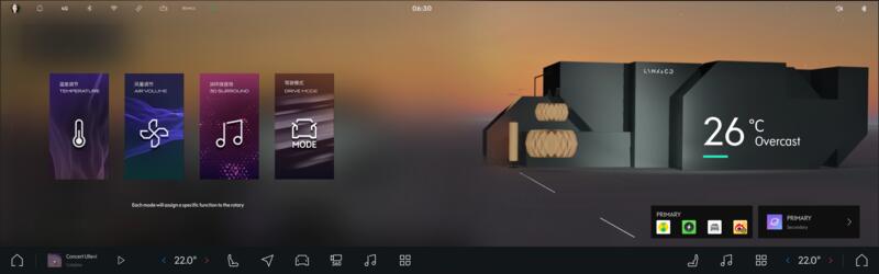
Feature 05
Energy Center
Happy path, plus every failure state. Charging error. Gun insertion. Battery warmup. Designed on paper, not discovered on the road.
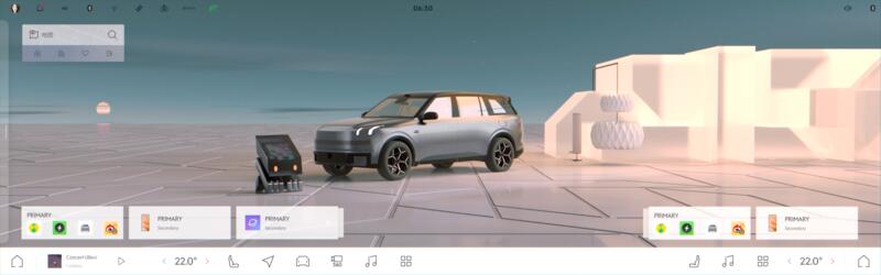
Feature 06
Showfloor Mode
The OS staged for the sales floor. Confident, calm, ready to be walked around.
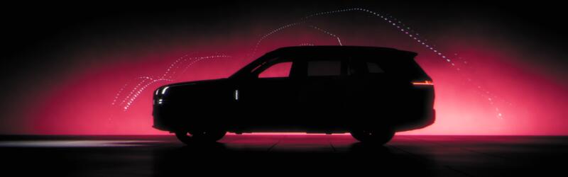
One camping scene took thirty six hours to render. Every exterior design change meant rebuilding the car in the scene, then waiting the render out again. Design at this scale is patience.
20
A design system that lives in light
Five times of day.
One brand identity.
Most design systems have a light mode and a dark mode. Ours had to live in actual light. Unreal Engine renders the cabin under sunlight conditions that match the real world, not arbitrary theme switches. So we built five palettes that move with the sun.
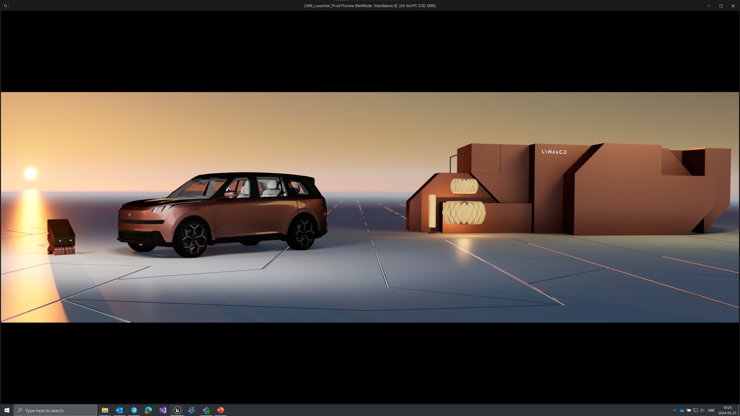 Dawn
Dawn
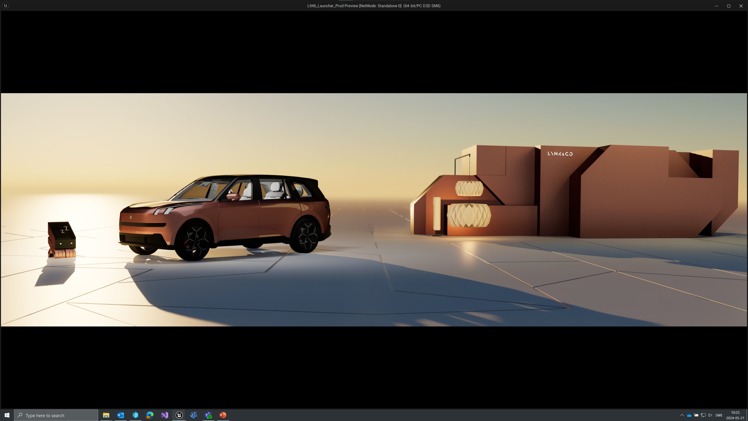 Morning
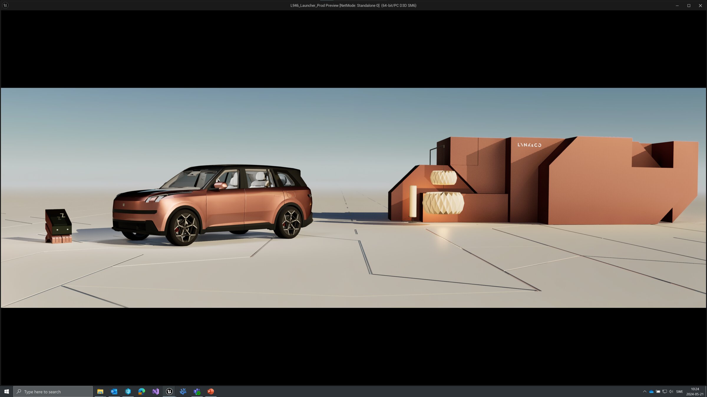 Midday
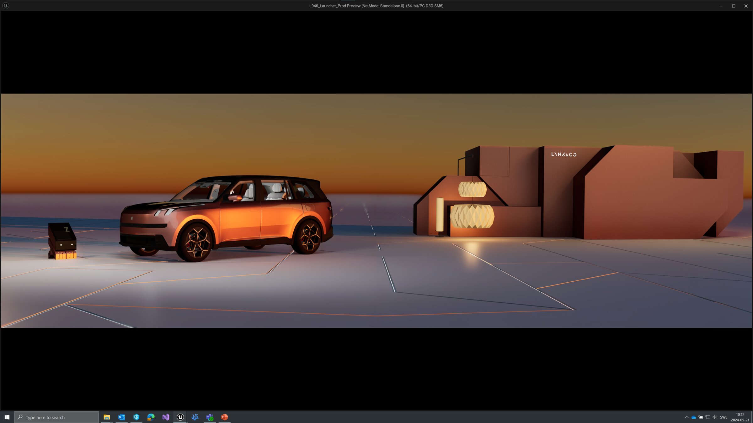 Dusk
Dusk
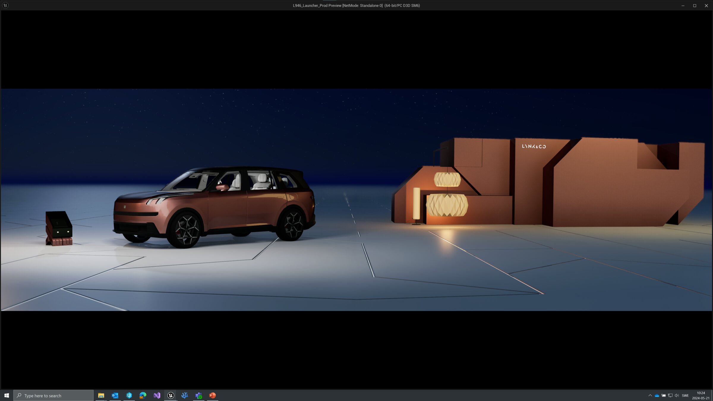 Night
Night
Each palette tested against the actual cabin under live Unreal Engine lighting.
21
The design system
The invisible skeleton
underneath every screen.
The moments you see are held up by a system you don't. A grid. An icon library. A component set. A button library. Plug-ins the team ran every day. Icons for the physical panels. All rebuilt from zero. Made to travel to the next car.
Piece 01
Flexible Grid
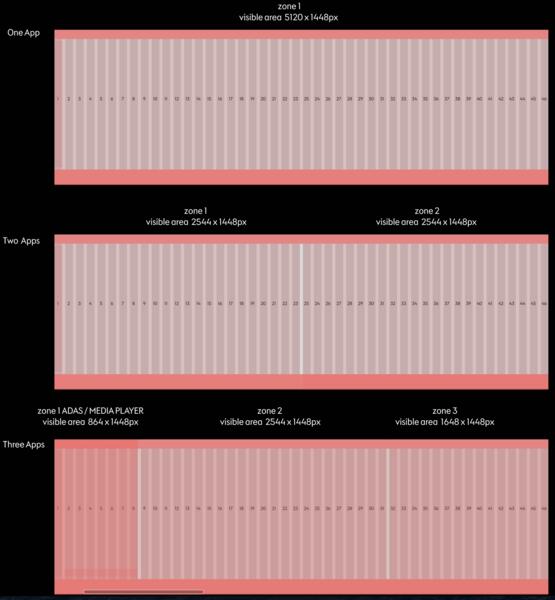
One component size for CSD and RSD. Portable across L946 and the next flagship (L955). Same skeleton, different bodies.
Piece 02
Brand Icons
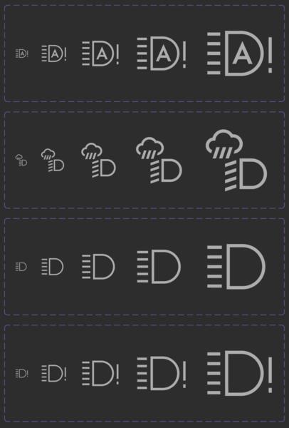
Redrawn in five fixed sizes. Rescaling stopped costing designers their afternoon.
Piece 03
Exterior Icons
Low resolution icons for the LED screens on the outside of the car. Pushing what an exterior screen could say.

Piece 04
Rebuilt Components
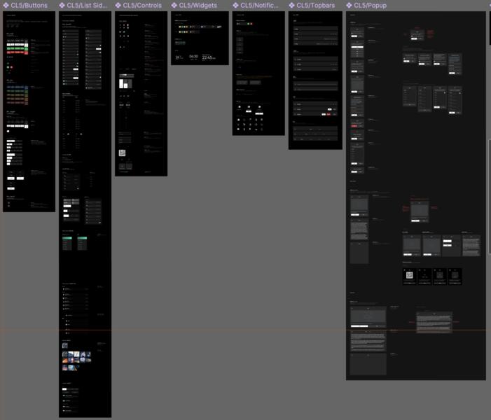
Every Meizu component redrawn from zero. Centralised. No more chasing "the latest" file.
Piece 05
Button Library
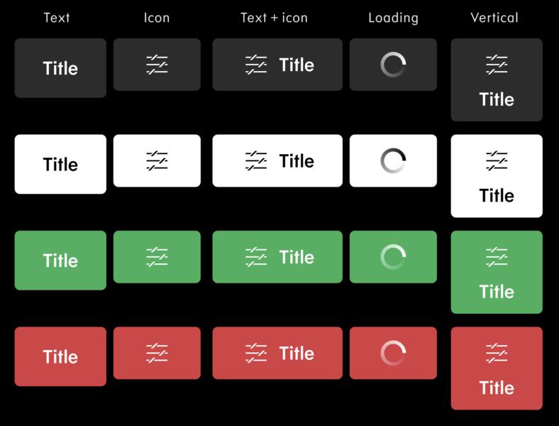
Any button, any state, any mode. Editable straight from a Figma dropdown. Works in light and dark.
Piece 06
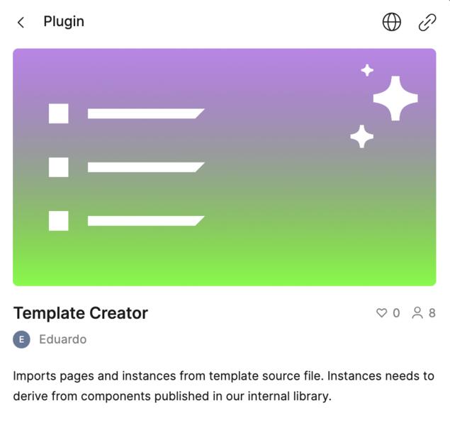
Plug-ins
Custom coded, thanks to Eduardo. Designers could find and verify the right component in a click. No hunt.
Piece 07
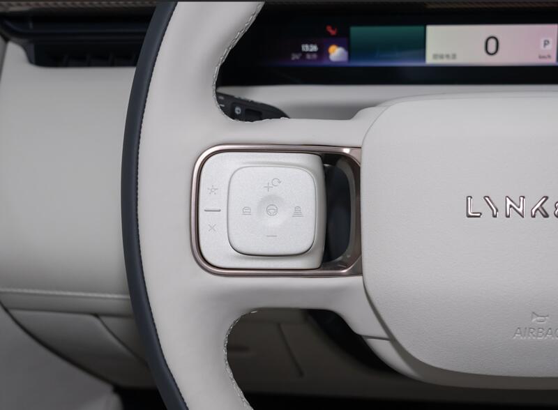
Physical Icons
The icons on the steering wheel, doors and panels. Designed with the interior team, so screen and hardware spoke the same language.
22
Rear seat
The back seat
is where the family lives.
The front cabin gets the attention. The back seat is where the children ride, where the parents settle, where the long trip actually happens. The rear display had to earn its own design.
First concept
One room, one story
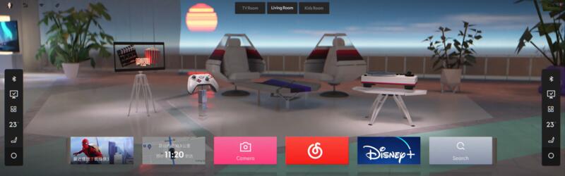
A single 3D room with a day-to-night shift across the ride. Beautiful. But one scene, one story, one atmosphere.
New concept
A room of your own
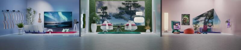
Three small worlds. Each with its own atmosphere, its own props, its own micro-life. Passengers pick where they want to be for the ride.
An inspiration board became a design language. The back seat stopped being an afterthought.
23
Delivery
Shipped to production.
Running on real roads.
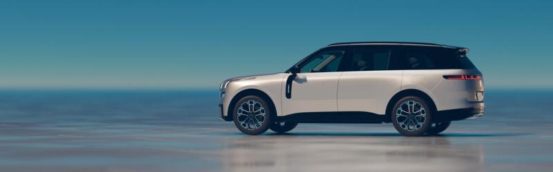
A flagship production vehicle, sold in China today. Six seats. The most demanding silicon on the market. The longest AR HUD ever shipped in a production vehicle. More than ten thousand exterior LEDs. All driven by one design language.
6
Seat configuration with full HMI integration across every row.
2×
Snapdragon 8295 chipsets driving the 3D OS in real time.
95″
AR HUD spanning the windshield, designed in step with the OS.
256
RGB ambient lighting gradients, synced to the UI and the music.
10,192
Exterior LED units coordinated with cabin states.
Thor
Nvidia Drive Thor. The next generation compute platform behind the experience.
24
Built to last
I built the infrastructure
to outlast the project.
Senior design work is not measured in pixels shipped. It is measured in the team you leave behind. The one capable of taking the work further than you could alone.
Legacy 01
Internal design community
Designers across Stockholm and Shanghai meeting regularly. Sharing work. Learning from each other.
Legacy 02
Knowledge sharing sessions
Methodology, brand, system, motion. Recorded, documented, accessible to every new designer.
Legacy 03
OTA generation reviews
A repeatable process for every software release. No more breaking what already worked.
Legacy 04
A design system that evolves
Not a frozen artefact. A living foundation for the next generation of Lynk and Co cars.
25
Reflection
What I would
do differently.
Every project teaches you something. Honesty about what could have been better is part of the craft. Three things I would change with the perspective of now.
Lesson 01
Bring engineers in earlier
Unreal engineers joined from concept through delivery, but not in the very first sketches. Earlier collaboration would have surfaced constraints before they became compromises.
Lesson 02
Sharpen the generational insight sooner
The digital native versus analogue driver finding came mid research. Had it surfaced earlier, the entire brief would have crystallised faster.
Lesson 03
Build the community from day one
I built the design community after the system shipped. With hindsight it should have started during the work, not after.
Complex systems with real engineering constraints can still be beautifully designed.
That is the standard I carry into every project. Mo Aldulaymi · calminterface.com
Want to talk in detail?
Happy to walk through any of this live. Sketches, archived prototypes, the messy middle.
Get in touch